Design isn’t just about what works – it’s also about what feels like it works. This week, we’re diving into timeless design principles that shape how users perceive, trust, and navigate interfaces. From the Aesthetic–Usability Effect to the Law of Common Fate, these rules explain why some designs feel effortless and how you can use them to make your work clearer, sharper, and more memorable.
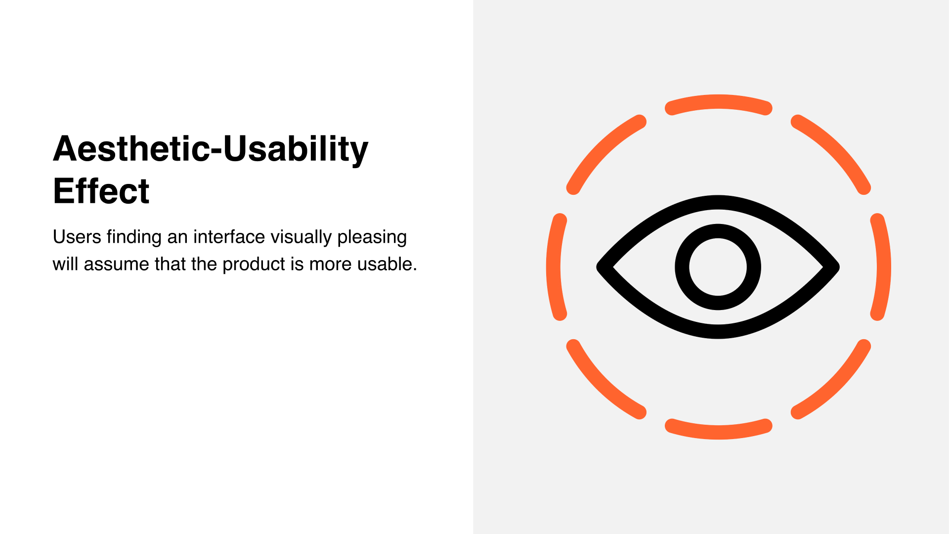
The Aesthetic–Usability Effect
Why even bother making things look good? Isn’t solid usability enough?
Back in 1995, the Hitachi Design Center studied this question. Their finding: when people see a visually pleasing interface, they assume it is more usable. In milliseconds, we decide that if it looks better, it works better.
This is both a joy and a curse.
A joy, because good aesthetics create trust and make users more willing to try a product (and forgive small bumps). A curse, because this bias can distort usability testing; what feels “easy” in a polished UI may not actually be easy to use.
💡 Takeaways
- Begin with UX foundations, including wireframes, flows, and information architecture.
- Then refine with UI: polish for your target audience in a way that looks and feels right.
- Always test and validate. Aesthetics are a means to an end, not the end goal.
In short: Looks matter, but they only work when they build on strong UX.
Next up in the series: another favourite principle to sharpen your design eye. Make sure to follow.
For more info, have a look at
📚 → Full UI Principles course: moonlearning.io/ui-principles-preview
📚 → All my courses: moonlearning.io/store
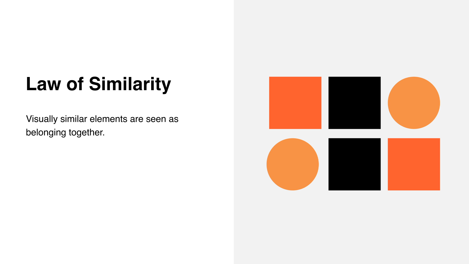
The Law of Similarity
Why do some interfaces feel instantly organised? Because our brains group things that look alike. When elements are visually similar, we perceive them as related.
Use similarity on purpose:
- Colour is the strongest cue. Reserve your highlight colour for interactive elements like links and buttons, not for decorative headlines.
- Size signals hierarchy and relatedness. Keep comparable items the same size, and differentiate intentionally.
- Shape creates family ties. A consistent button shape reads as one group and sets the expectation of clickability.
- You can combine cues. Orientation, behaviour, and movement also reinforce grouping. Aligned items, shared hover states, or matching micro-interactions feel like one set.
Build it into your system:
Create a clear style guide. Define a colour palette with neutrals, highlight, and action colours. Set type styles for headings, body, links, buttons etc. Apply the same tokens and rules inside components so users get consistent signals.
Watch out for traps:
If everything looks clickable, nothing is clear. Do not rely on colour alone for meaning. Pair colour with size, shape, labels, or underlines. Check contrast and test with real users so visual polish does not mask usability issues.
💡 Takeaways
- Visually similar items are perceived as related
- Start with a system: colour roles, type scales, and component rules
- Use similarity to guide, not to decorate
- Pair colour with size and shape for clarity and accessibility
- Validate with testing so appearance does not overrule reality
In short: make related things look related, and make interactive things look interactive.
The Law of Common Region
Elements placed inside a defined region are perceived as belonging together. This principle wasn’t part of the original Gestalt rules but was added later by Palmer in the 90s. And while it may sound like a small detail, it makes a huge difference in clarity and structure. Trust me, once you see it, you’ll notice it everywhere on well-designed pages.
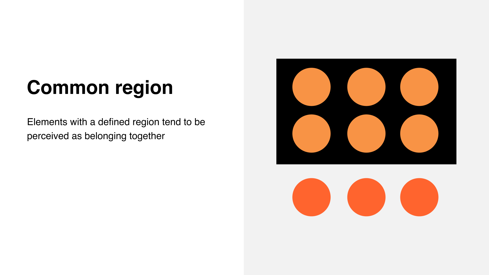
How it works:
- A region can be created with a background colour (like a really subtle tint), a border, or an outline
- Everything inside that region feels grouped, separate from what’s outside
- It provides instant clarity about what belongs together
Why it matters:
- Without regions, layouts can feel flat and confusing
- With regions, users understand structure at a glance
- Regions reduce cognitive load by giving clear visual boundaries
💡 Takeaways
- Elements in a defined region are perceived as related
- Use regions to structure layouts and reduce user effort
- Regions can be colour fills, outlines, or subtle separators
Cards and panels are practical applications of this principle
In short: A common region is one of the simplest ways to create structure, and one of the most powerful.
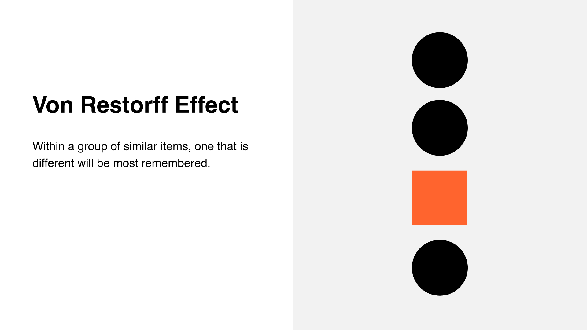
The Von Restorff Effect
The Von Restorff Effect, also called the isolation effect, states that within a group of similar items, the one that stands out will be most remembered.
A classic example is the pricing table. All options are designed to look like one family (law of similarity), but the plan you actually want people to choose is highlighted with colour, size, or emphasis. That difference makes it the one users recall and select.
How it works:
- In a sea of sameness, the distinct element attracts attention
- Our brains are wired to notice anomalies and give them more weight
- Even small differences in colour, shape, or typography can create strong contrast
Why it matters:
- Great for highlighting your primary call to action or recommended feature
- Helps focus user attention where it matters most
- Can guide users through complex choices by removing ambiguity
Examples in practice:
- Pricing tables where the “recommended” option is highlighted
- Navigation menus where one item is styled as the current page
- Forms where the primary action button is distinct from secondary ones
- Landing pages where the main CTA stands out against secondary links
💡 Takeaways
- In a group of similar items, the one that is different will be most remembered
- Use colour, size, or shape to highlight key actions or features
- Ensure contrast is sufficient and accessible to all users
- Use sparingly; if everything stands out, nothing does
In short: Make the one thing you want remembered different from the rest.
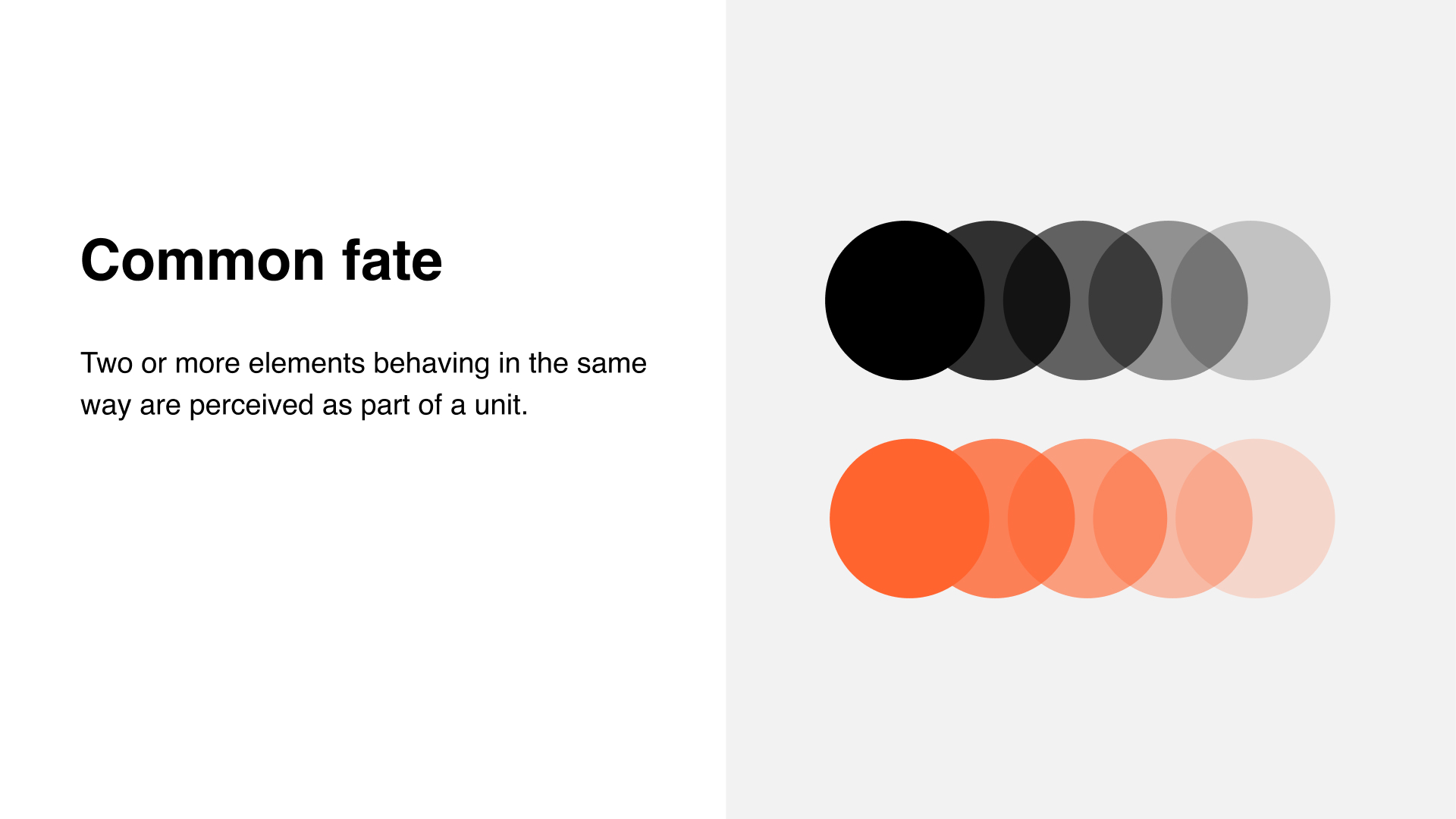
The Law of Common Fate
Two or more elements behaving in the same way are perceived as part of a unit. It does not matter how far apart they are placed or how different they look. If they move, animate, or change together, our brains group them.
Why it matters:
- Common fate is especially powerful in interactions
- It sets clear expectations by showing that if one element behaves a certain way, others in the group will too
- This reduces cognitive load and builds user confidence in navigating your interface
Examples in practice:
- Slideshows: arrows or dots move content together, so you know each item belongs to the set
- FAQ accordions: open one item, and you know the others will expand in the same way
- Loading indicators: dots or bars moving in sync feel like part of one system
- Menus: items sliding in or fading together reinforce that they belong as one group
Tips for use:
- Elements do not need to look the same or sit close to each other, behaviour is the glue
- Use motion and animation carefully to guide, not distract
- You can even omit explicit icons (like arrows) if the interaction pattern is consistent and clear
- Combine with proximity or similarity to reinforce grouping further
💡 Takeaways
- Elements that move or change together are perceived as one
- Common fate is a strong tool for interaction design and layout clarity
- Consistency in behaviour reduces user learning effort
- Motion should support usability, not act as decoration
In short: What moves together, belongs together.
For more info, have a look at
📚 → Full UI Principles course: moonlearning.io/ui-principles-preview
📚 → All my courses: moonlearning.io/store
Moonlearning news:
Upcoming Talks & Workshops
I love to combine these trips with guest lectures, exploring new projects, or simply exchanging thoughts over coffee. So, please reach out if you’d like to connect in person.
Smashing Conference, October 2025
Conference Talk – New York, USA 🇺🇸
Fashion Institute of Technology - NYC, October 2025
Guest Lecture – New York, USA 🇺🇸
UI Principles Masterclass by IxDF, October 2025
Figma Masterclass – Online 🖥️
Content Convention, November 2025
Conference Talk – Mainz, Germany 🇩🇪
Figma Masterclass by Smashing Conferences, December 2025
Figma Masterclass – Online 🖥️
Smashing Conference, April 2026
Conference Talk – Amsterdam, Netherlands 🇳🇱
DaFed Conference, May 2026
Conference Talk – Novi Sad, Serbia 🇷🇸
See all workshops and events -->
Want to learn more about Figma, UI and Building?
Get a moonlearning.io membership today and access all courses, from beginner to pro, covering Figma, UI and UX principles, and how to not only design but also build your own websites and products.

Responses