This week is all about Figma components. If you use one feature in Figma, let it be this one. You can’t build a solid UI without components. The basics are simple, but there’s a lot around them worth knowing.
Let’s get the terms right to start the week:
💠 Figma Component
A component is a reusable design element.
You can turn anything into one: a button, navigation bar, or card. Oh, and you can nest them! These components live outside your design and act as the single source of truth.
💠 Instance
When you copy a component, that copy is called an Instance.
You can use instances across all your designs. Any change in the main component is updated automatically in every instance.
You can override parts of an instance, like text, images, or colours.
It’s important to understand what should and shouldn’t be overridden.
I’ll cover that later this week in detail.
💠 Component Properties
These are the controls for your component.
You can toggle icons, swap text, hide sections, or change variants without digging through layers. They make your components smarter, cleaner, and easier for the team to use and communicate possibilities.
💠 Component Sets and Variants
When you have a few versions of the same thing (for example, Card, Hover, Default), Figma lets you group them into a Component Set. Each version inside that set is a Variant. They stay connected and are easy to switch between.
💠 Component Properties
These are the controls for your component.
You can toggle icons, swap text, hide sections, and change variants, without digging through a mess of layers. They enable your components to communicate clearly to anyone using them what can be changed in what ways, making them smarter and cleaner.
💠 Figma Component Libraries
This is where everything lives. Shared components that anyone on the team can use. It can be a dedicated page in your Figma file or a separate library you pull in.

To override or not to
Figma lets you override almost anything in an instance. Text, images, colours, even layout settings. It’s tempting to tweak things to make small variations, but that’s where design systems start to fall apart.
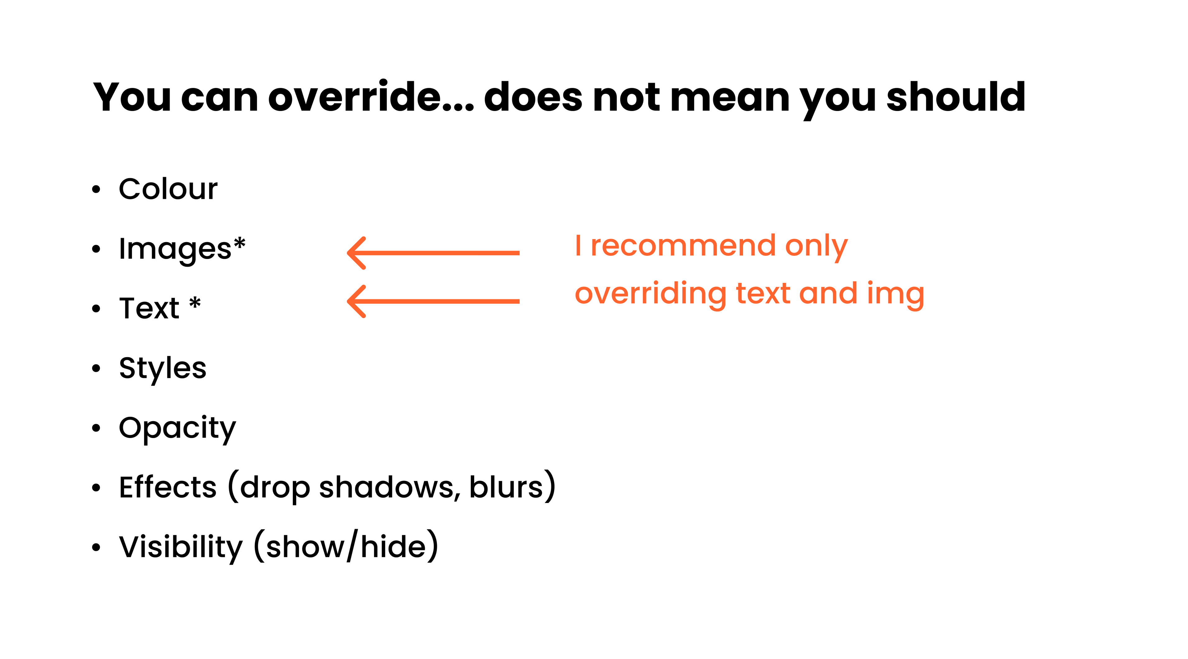
Only override content.
That means text and images, things that could change dynamically, like database content.
Never override design or layout elements.
Those belong to the component itself and need to stay consistent for development.
If you need a new visual state, create it as its own component and group versions in a component set with variants. This keeps your design clear, consistent, and easy to hand off.
And even if you don’t use every variant yet, plan for them, like input errors or disabled buttons.It shows intent and keeps your system ready for what’s next.
Quick Tip: Use Sections
Did you know that placing your components inside a section automatically creates subfolders in your Assets panel?
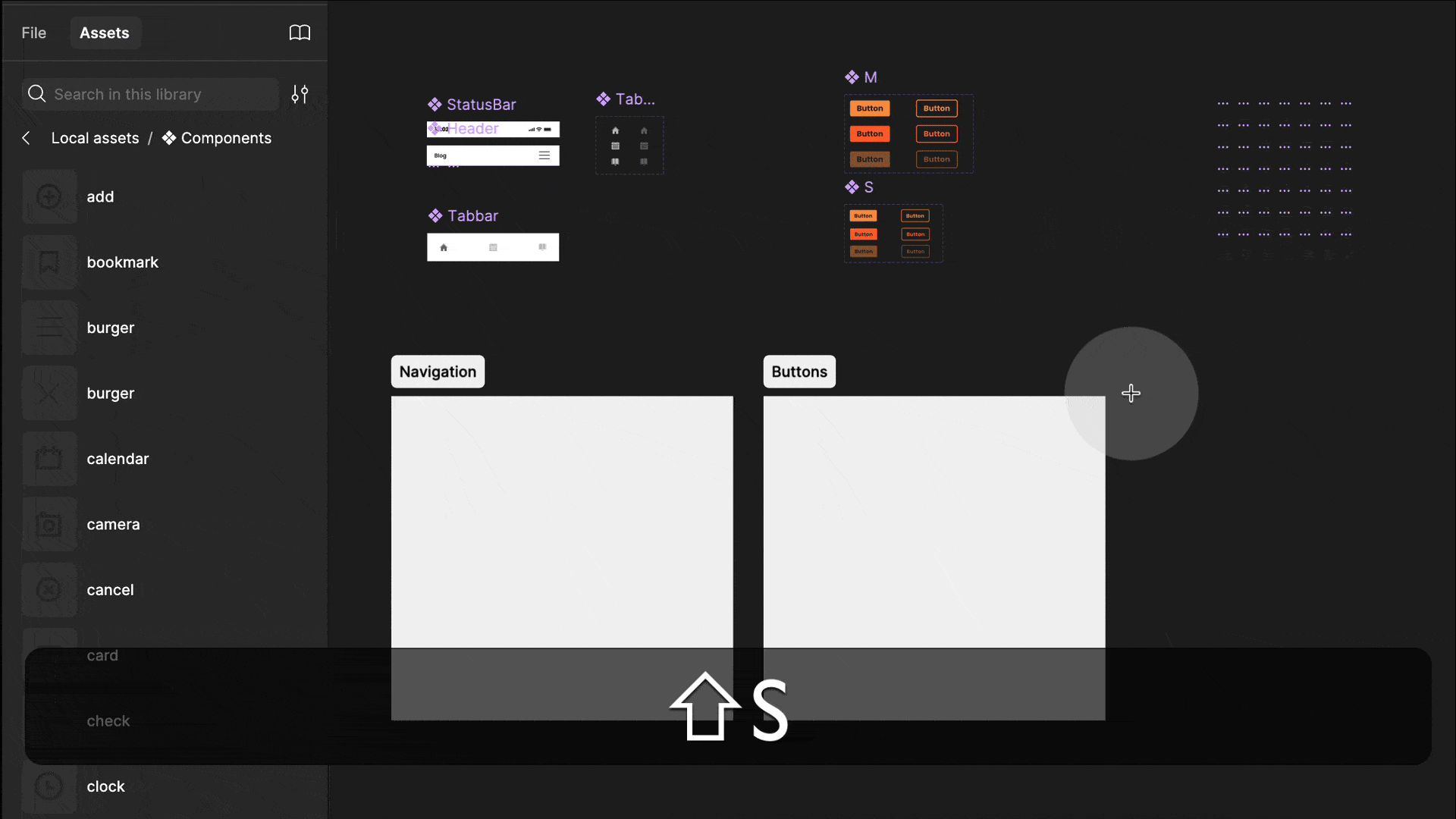
You can still use the “/” naming convention to organise components, but sections are better. Press Shift + S to create a section, then drag your components onto it. Figma will create a subfolder automatically.
You can move components or rename sections anytime, so this setup stays flexible.
Faking Container Queries in Figma
I love container queries. They’re the coolest thing since sliced bread. So what do they do? Instead of querying the viewport like we do with breakpoints, container queries look at the container that holds your element.
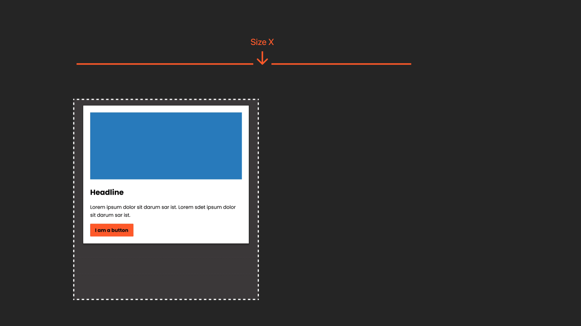
That means you can use the same component across a page, and it will adapt to the space it’s in.
Perfect fit, every time. A designer’s dream. Now, here’s the catch: Figma doesn’t have container queries yet.
It doesn’t even have breakpoints (unless you’re using Figma Sites). However, if you want to explore the concept and communicate it to your development team, there’s a simple way to fake it.
Note that this only works for size-based queries, which are also the most common.
️▶️ → A free conference talk video where I explain this in detail
📚 → A free article with step-by-step instructions
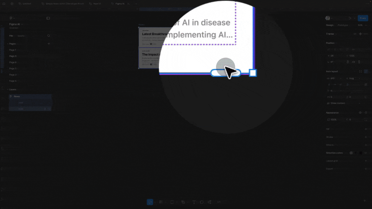
Quick Figma Tip: Magic handle.
This is my favourite hidden feature. Within two or more identical instances (ensure auto layout is applied), a small handle will appear. Pull it down to create additional instances and have the content automatically adjust. I love it!
Full Figma component course
Want to master components? Check out my full course — it covers everything from building your first component and working with variants and properties to advanced setups with variables, responsive design, and documentation best practices. You can find it here!

Moonlearning news:
Upcoming Talks & Workshops
I love to combine these trips with guest lectures, exploring new projects, or simply exchanging thoughts over coffee. So, please reach out if you’d like to connect in person.
Content Convention, November 2025
Conference Talk – Mainz, Germany 🇩🇪
Figma Masterclass by Smashing Conferences, December 2025
Figma Masterclass – Online 🖥️
Smashing Conference, April 2026
Conference Talk – Amsterdam, Netherlands 🇳🇱
DaFed Conference, May 2026
Conference Talk – Novi Sad, Serbia 🇷🇸
See all workshops and events -->
Want to learn more about Figma, UI and Building?
Get a moonlearning.io membership today and access all courses, from beginner to pro, covering Figma, UI and UX principles, and how to not only design but also build your own websites and products.


Responses