The no-code space is moving fast, and the tools keep getting better. Webflow, Wix, Squarespace, Framer — and now Figma Sites. Each one has its place, but as a designer, I’m especially excited about what Figma is doing.
This week, I’ll walk you through the essentials of Figma Sites: from publishing a site in minutes, to creating your own responsive blocks and libraries, to adding those small but powerful touches like sticky navigation or light/dark mode.
If you’ve been curious about how Figma Sites works in practice, or you’re just looking for faster ways to get from design to live, this is for you.
Let's compare the main players
The no-code website builder space is crowded.
Framer, Webflow, Wix, Squarespace, and now a new star on the horizon: Figma Sites. As a long-time Figma fan, it might not surprise you that I will focus on Sites. But let’s run an honest overview, because it is not a one-size-fits-all solution.
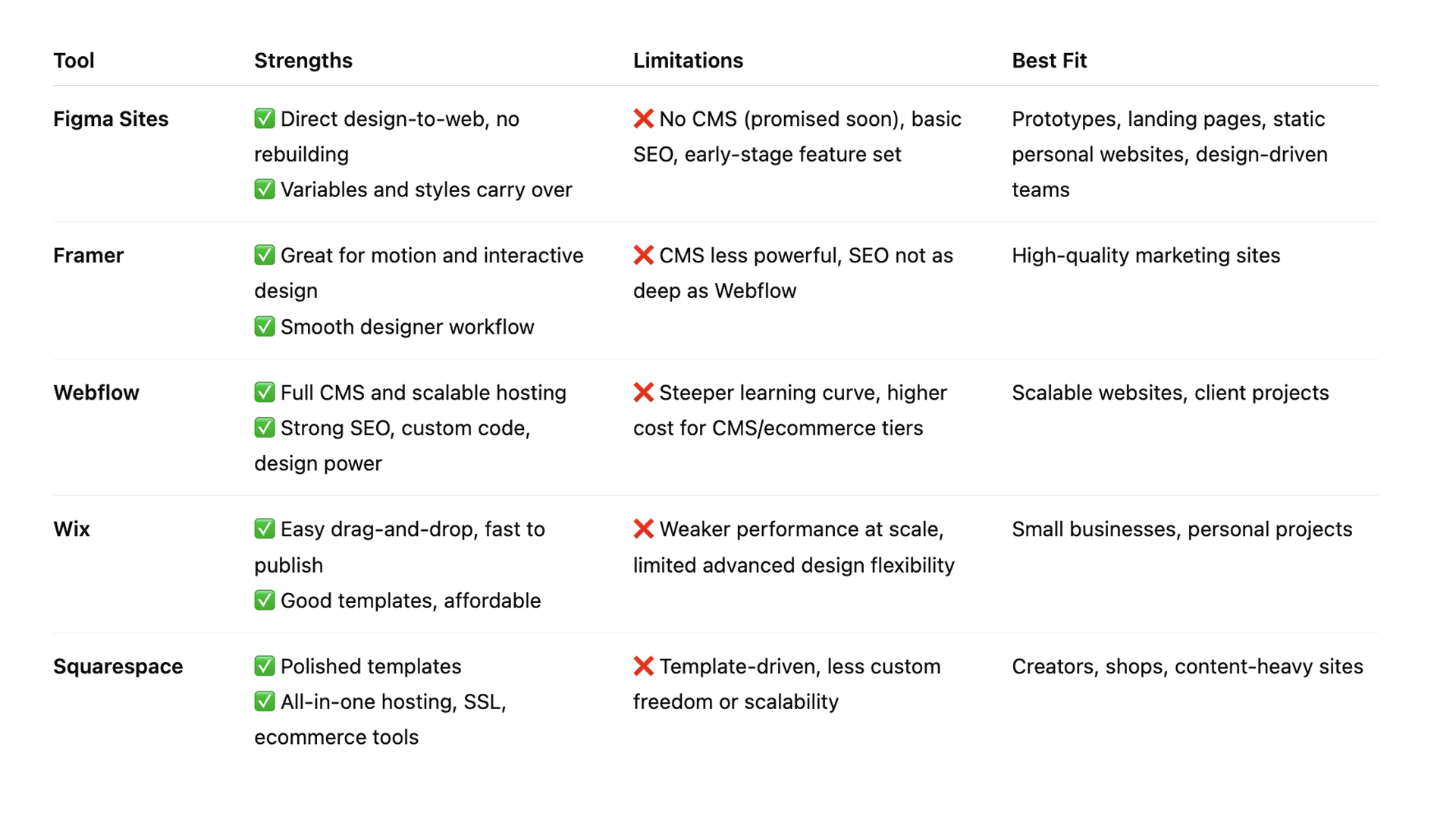
Figma Sites
✔ Direct design-to-web, no rebuilding
✔ Variables and styles carry over
✘ No CMS (promised soon), basic SEO, still early-stage
Best fit: prototypes, landing pages, static personal websites, design-driven teams
Framer
✔ Great for motion and interactive design and analytics
✔ Smooth designer-friendly workflow
✘ CMS less powerful, SEO not as deep as Webflow
Best fit: high-quality marketing sites
Webflow
✔ Full CMS and scalable hosting
✔ Strong SEO controls, custom code, advanced design freedom
✘ Steeper learning curve, higher cost at CMS/ecommerce tiers
Best fit: scalable websites, client projects
Wix
✔ Easy drag-and-drop, fast to publish
✔ Good starter templates, affordable pricing
✘ Weaker performance at scale, limited flexibility
Best fit: small businesses, personal projects
Squarespace
✔ Polished templates and strong ecommerce/blogging tools
✔ All-in-one hosting, domain, SSL included
✘ Template-driven, less design freedom at scale
Best fit: creators, shops, content-heavy sites
In short:
-
Webflow is the most complete if you need scalability, advanced SEO, and a real CMS.
-
Framer is the best design-first tool for polished marketing sites with animation and solid analytics
-
Wix is the easiest starter for small businesses and quick sites.
-
Squarespace is the most polished out-of-the-box for creators and shops.
- Figma Sites is the fastest workflow for designers who want to publish directly from their files. As a huge Figma fan, I will focus on this tool this week and show you how to set up your page and some great tips and tricks!
Let's make a website using Figma Sites!
This week is all about setting up a website super fast. With Figma Sites, it literally takes 10 minutes from design to live. Here’s how I do it:
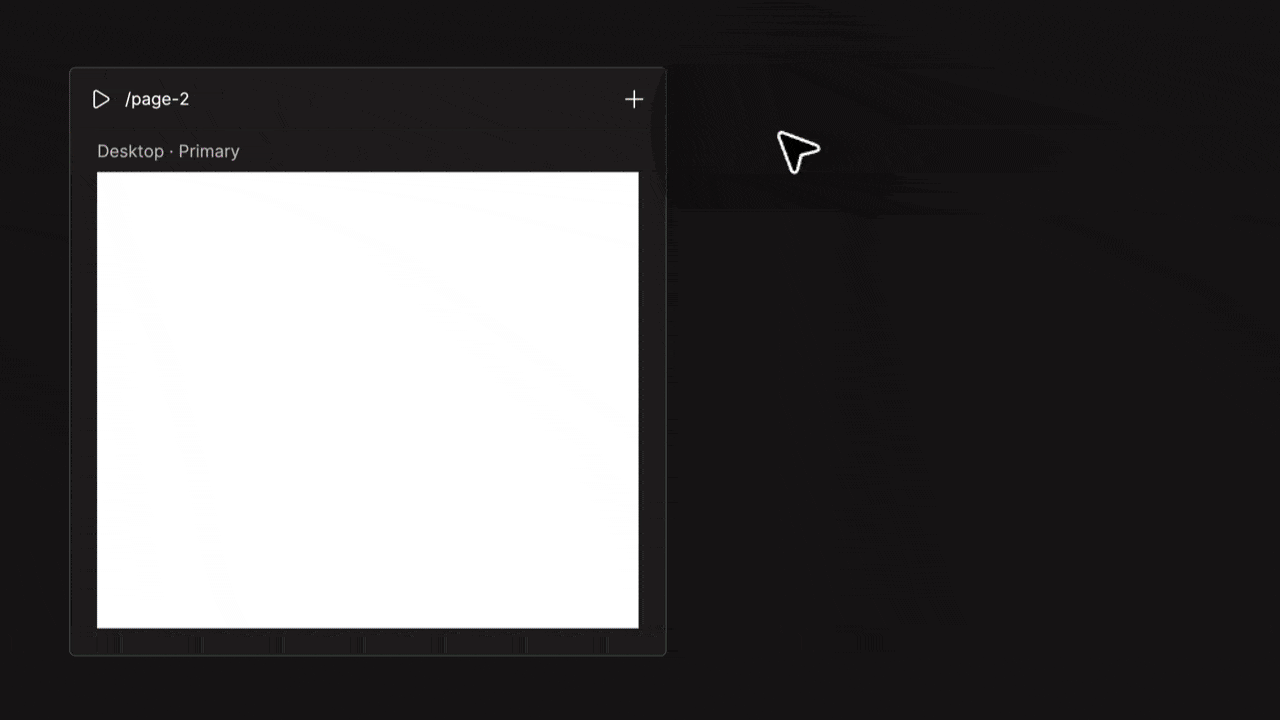
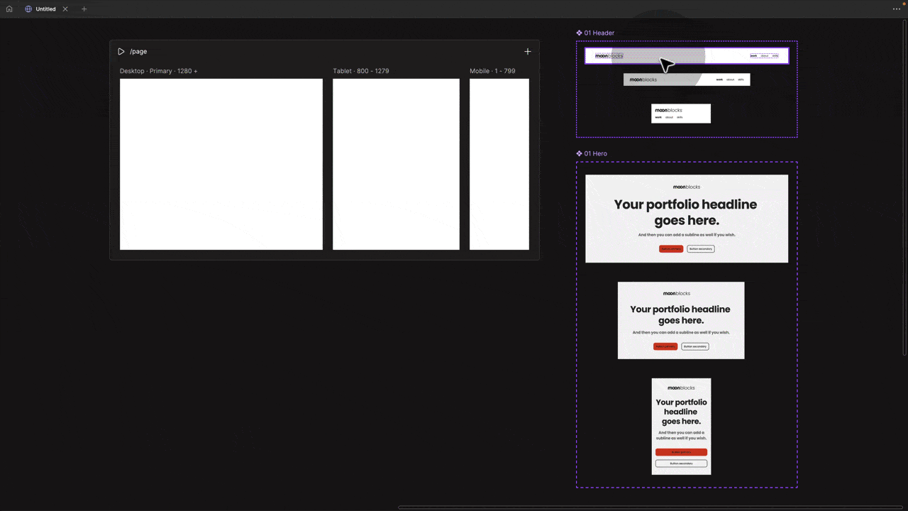
1. Open a new Figma Sites file
You’ll see a page template ready to go. I recommend adding three breakpoints: desktop, tablet, and mobile. (Not my favourite naming either, but that’s how it works for now.)
2. Use Figma Blocks
Click the plus icon in the menu and drag a block onto your primary frame (by default, that is the desktop). They will populate the other breakpoints for you.
👉 Pro tip: Right-click on another breakpoint frame to make it your primary, e.g., mobile.
3. Responsive out of the box
Blocks are pre-built with auto layout. No fiddling. Add your images, swap text, and changes cascade across breakpoints. Beautiful!
4. Tweak per device
Delete or adjust elements on tablet or mobile as needed.
5. Preview & publish
Hit play to see your functional site. Like it? Hit publish. Figma gives you a free URL, or you can connect your own domain. I have a YouTube tutorial explaining how to publish.
And yes, you can also link subpages, just repeat this process and use the prototyping menu.
The magic here is speed: from blank file to live site in minutes, without touching code.
I made a free 20. min introduction tutorial on YouTube to get you started:
|
Quick Tip: fixed navigation in Figma Sites
Setting up fixed navigation in Figma Sites is relatively straightforward, but there are a few pitfalls to be aware of along the way. Here’s how it works step by step:
|

By default, the navigation scrolls with the page. To fix it at the top:
- Select the navigation. In the right-hand properties panel, under Position, change it from Relative to Fixed.
- You’ll notice the entire page content jumps up. This happens because the navigation has been taken out of the auto-layout flow.
- Select the navigation and check its height (e.g., 90 or 110 — this may vary depending on breakpoints so you might set it for each).
- Add this value as Top padding on the Page (!!!) frame. This pushes the content down by the correct amount.
- If you jump into Preview, you’ll see it kind of works but sticks to one side when resizing. That’s because it’s no longer inside auto-layout. To fix this, set the Constraints (in the right-hand panel) to Left and Right.
And that’s it! 🎉 Hit Preview and you’ve got a perfect fixed navigation. Yes, sticky works too!
Build your own responsive blocks in Figma Sites
One of my favourite parts of Figma Sites is that you can create custom components that automatically adapt to breakpoints. It means you’re not limited to the default blocks; you can run your own library.
Here’s how it works:
-
Create three versions of your component for desktop (1280), tablet (800), and mobile (375).
-
Add auto layout to each (no more excuses, you’ll need it here).
-
Turn them into a component set.
-
Name the variants “desktop,” “tablet,” and “mobile.” That naming is important — it’s what pulls in the other versions once you drop an instance onto the primary frame.
-
Now drag an instance of your primary (per default desktop) onto your frame, and Figma automatically fills in the other breakpoint versions pulling them from your component set.
👉 Note: Set your parent frame to vertical auto layout + hug, and make sure the block fills the container.
That’s it, you’ve got your own responsive blocks. Perfect for building a reusable library. Next up, let's learn how to make a proper library and connect it!
Setting up your own Library
So we learned how to create our own responsive components.
I want to take it one step further and show you how to set up an entire library where you can store these components and pull them directly into Figma Sites.
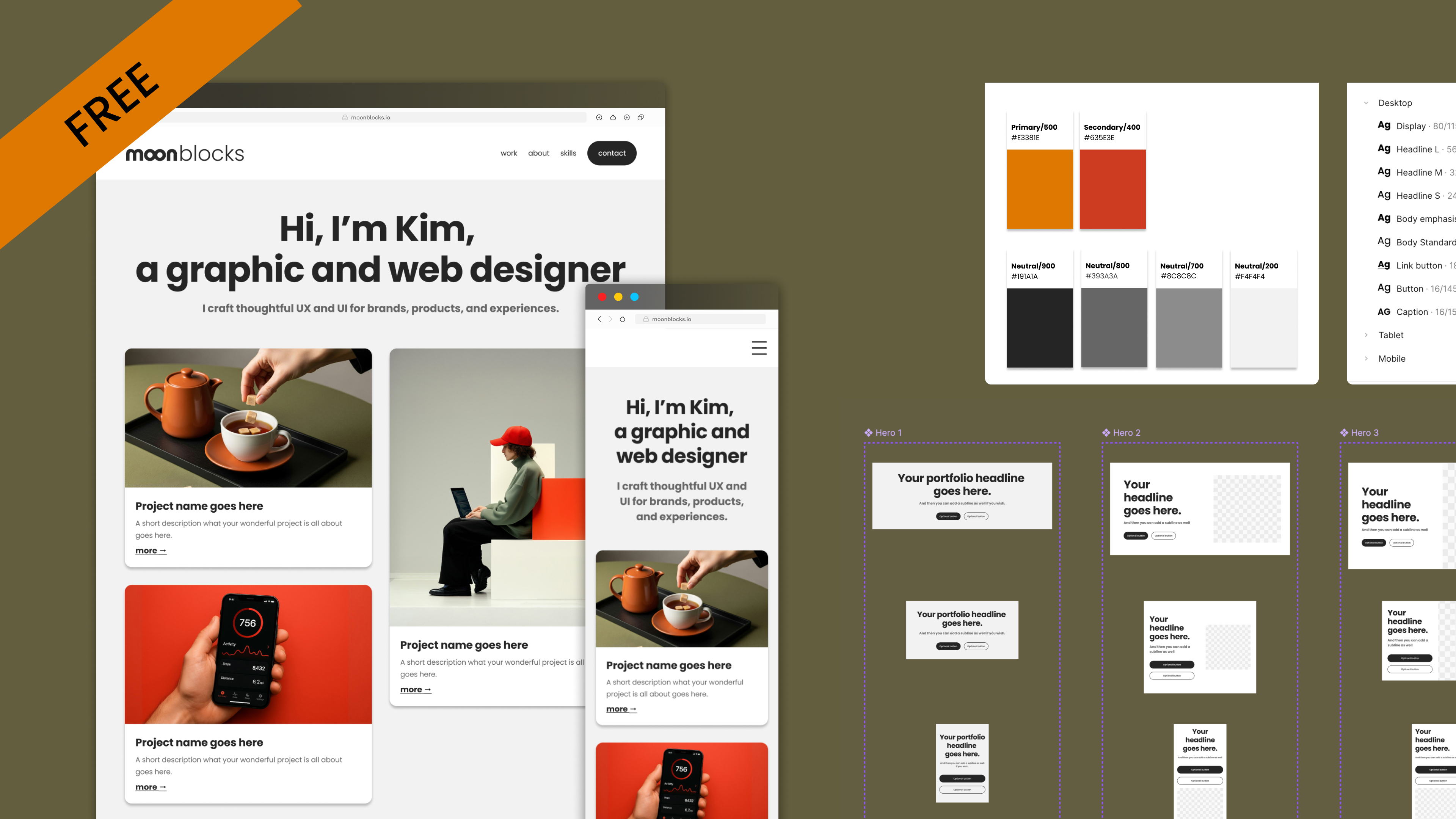
I made a free Figma library template and some free video tutorials to follow along here: moonblocks.io
In a nutshell:
-
Set up your library in Figma Design just like a Design System: colour variables, typography styles, variables, and components. For components, use the responsive setup I shared earlier. Then publish the file as a library.
-
Connect in Figma Sites: In Figma Sites, next to the premade Figma Blocks, you’ll see the “Library” tab. Search for your library and connect it with one click.
-
Use across projects: drag your components into your design just like Blocks. Any update is reflected in your Sites project, and you can reuse the same library across multiple projects.
This is by far my favourite feature. You can include light and dark mode, as well as responsive typography styles that adapt automatically to breakpoints. For more details, check out my free template and tutorials here:
👉 Download the free library here: moonblocks.io
👉 Free tutorials here: moonblocks.io/tutorials
Bonus tip! Use component properties in Sites components
If you add component properties to elements in your library, you can later toggle them on and off in Sites. Sweet!

If you want to learn more about component properties, I have a full course here 👉 moonlearning.io/Figma-components
Bonus Tip: Using Light and Dark Mode in Figma Sites.
Just like in Figma Design, you can set up modes in Figma Sites. Create two modes, light and dark, and switch between them with the mode switcher.
I am currently experimenting with adding a mode toggle directly to the front end so visitors can switch themselves. Still running into a few hurdles, but I will keep you posted.

Want more?
🌐→ Full Figma Sites course: moonlearning.io/figma-sites
👉→ More tips, tricks & tutorials: moonlearning.io
Moonlearning news:
Upcoming Talks & Workshops
I love to combine these trips with guest lectures, exploring new projects, or simply exchanging thoughts over coffee. So, please reach out if you’d like to connect in person.
Smashing Conference, October 2025
Conference Talk – New York, USA 🇺🇸
Fashion Institute of Technology - NYC, October 2025
Guest Lecture – New York, USA 🇺🇸
UI Principles Masterclass by IxDF, October 2025
Figma Masterclass – Online 🖥️
Content Convention, November 2025
Conference Talk – Mainz, Germany 🇩🇪
Figma Masterclass by Smashing Conferences, December 2025
Figma Masterclass – Online 🖥️
Smashing Conference, April 2026
Conference Talk – Amsterdam, Netherlands 🇳🇱
DaFed Conference, May 2026
Conference Talk – Novi Sad, Serbia 🇷🇸
See all workshops and events -->
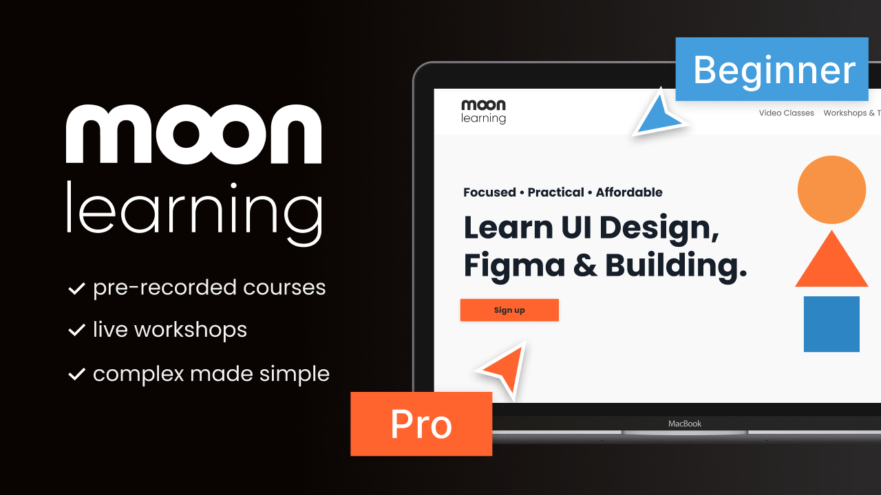
Want to learn more about Figma, UI and Building?
Get a moonlearning.io membership today and access all courses, from beginner to pro, covering Figma, UI and UX principles, and how to not only design but also build your own websites and products.

Responses