Welcome to the first edition of Moonletter! Each week, I’ll share one topic with a few practical nuggets. Little tips and tricks to keep your thoughts fresh and your workflow smart. Feel free to reach out with any topics you’d like me to cover. Let's start this week with tips and tricks around typography in UI & Figma:
Responsive typography in Figma with variables and modes
Responsive typography in Figma with variables and modes looks tricky at first, but once you get it, it makes scaling designs much easier.
How to set it up:
|

- Create text styles for your hierarchy (headlines, body, etc.). Start with a default size. If you want to learn more about creating a solid typography hierarchy, check out my courses on moonlearning.io
- Add a variables collection (I usually call it “Typography”) and run the plugin “Variabalize Text Styles” to convert size, weight, and font into variables with one click. You can of course re-order and rename them entirely to your liking.
- Add modes for the different breakpoints to your variable collection and adjust values like font size per mode. I usually have three — one for small, medium, and large screens.
- In your design, set up a frame for each mode and assign the corresponding mode (in the properties panel via the mode switcher). Text linked to variables updates automatically.
Why it’s worth it: - Using the same style name across breakpoints
- Consistent type across breakpoints
- One source of truth
- Faster iteration when things shift
For more info, have a look at
📚 → UI Typography Fundamentals: moonlearning.io/typography-preview
📚 → Full Figma Course: moonlearning.io/Figma-Beginner
So how does responsive typography work in Figma Sites then?
I got a lot of questions about how this works in Sites, so I made a little tutorial for you. In short: you can use the same setup you’d use in a design file: standard styles, variables, and modes. Turn that file into a library, and then use it directly in Sites.
|

👉 I made a free Figma file library with this setup for you to try out: moonblocks.io
You can also use Sites’ native settings, where you add breakpoints right inside styles. Personally, I find that a bit confusing and prefer sticking with styles + variables + modes, which you can also set up in Sites just like in a design file.
🌐→ Full Figma Sites course: moonlearning.io/figma-sites
A little gem to get your line height right
thegoodlineheight.com by Fran Pérez. It calculates the optimal line height for any text based on three factors:
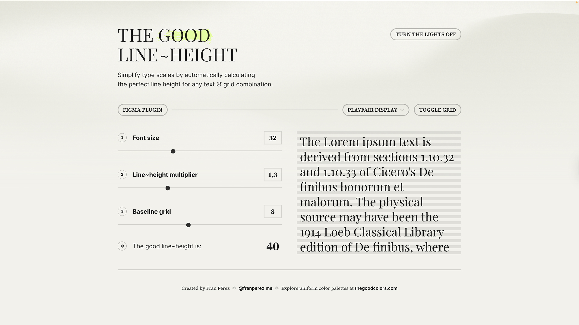
🔤 Font Size → adjust for the size of your text
📏 Line-Height Multiplier → fine-tune spacing
📐 Baseline Grid → align text to a grid structure (often 8pt or 10pt)
Get this balance right and your typography becomes not just pretty, but perfectly aligned and much easier to read.
Fran also built other excellent tools, like thegoodcolors.com,
which I’ll share more about soon.
Little tip: Use % for line height in Figma
By default, Figma sets line height in pixels. That can feel frustrating if you’re used to CSS, where you’d write something like line-height: 1.5.
👉 Workaround: switch to percentages.
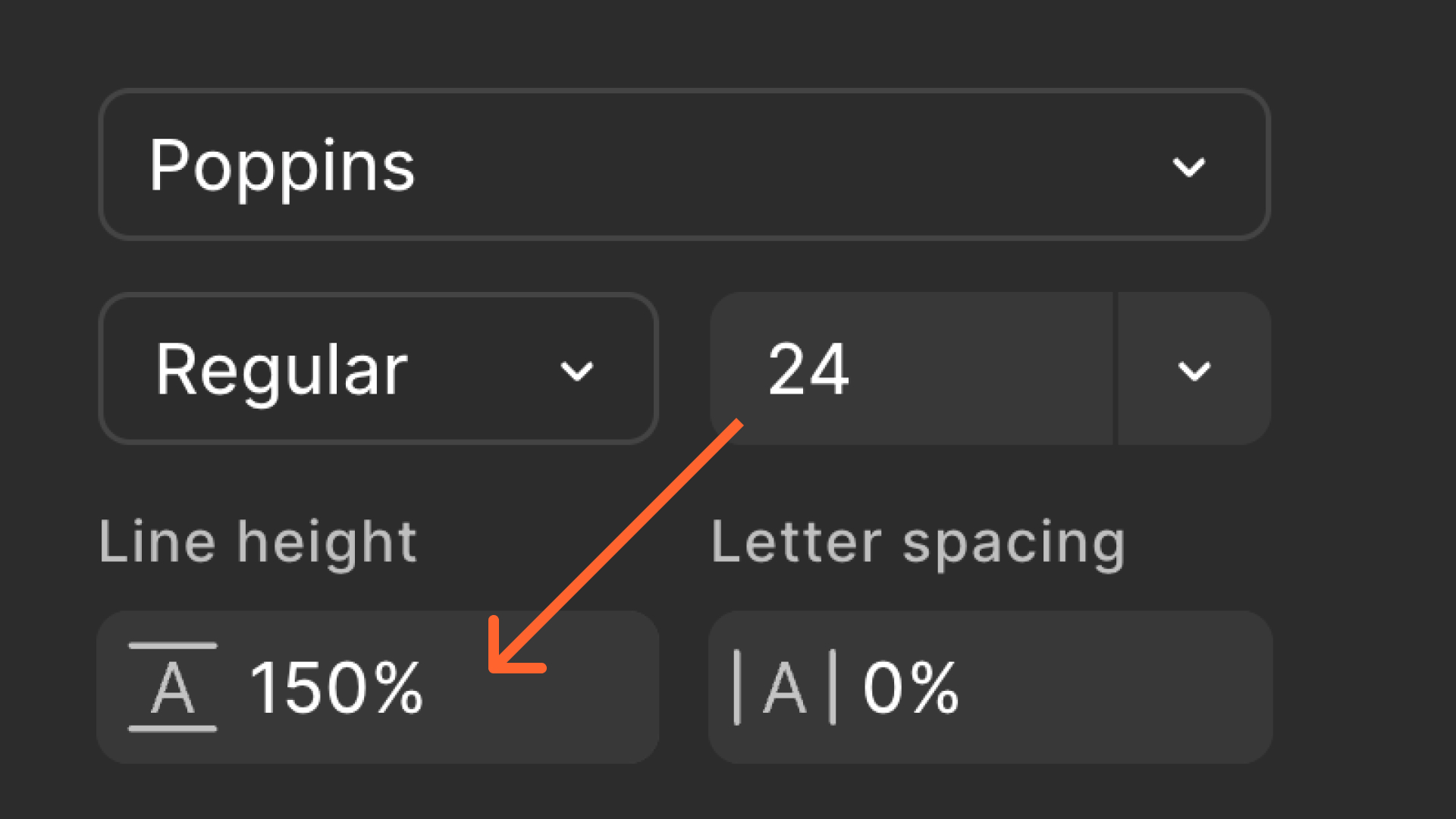
That way, when you change the font size, the line height scales automatically and stays consistent. Much closer to how typography behaves in code. In Dev Mode, Figma can translate line height into rem, but for designers working inside Figma, percentages are usually the smoother approach.
Downside: You can currently not convert this into a variable.
📚 → UI Typography Fundamentals: moonlearning.io/typography-preview
Understanding clamp() – what UI designers should know
Summary of an article I wrote:
Fluid typography is no longer just a nice-to-have. It’s expected. And CSS clamp() is one of the most powerful tools we have to make it happen. But as UI designers, we often stop at handing over static sizes, without fully understanding how things scale in the browser.
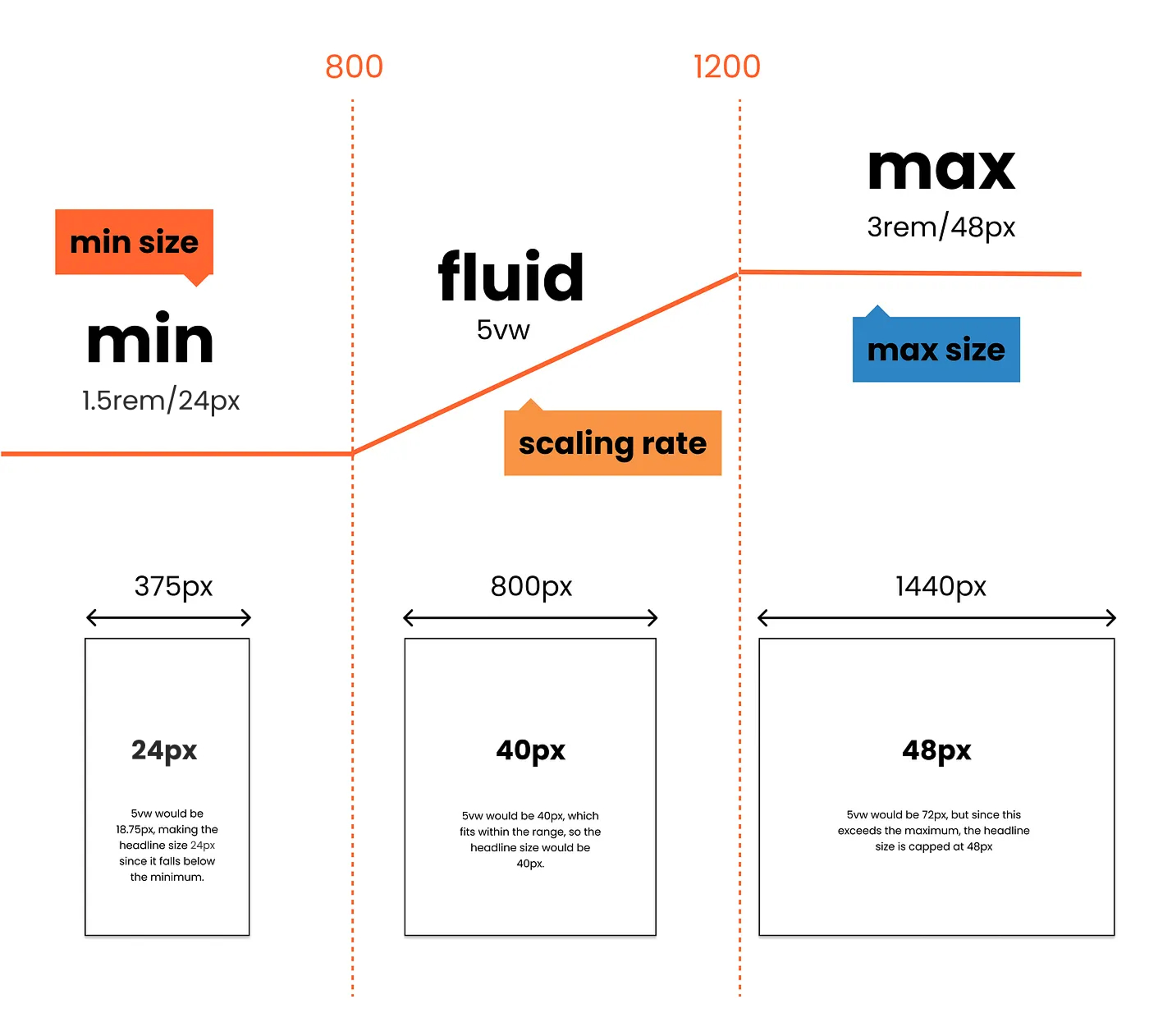
In my latest article, I break down what clamp() actually does and why it matters for design:
1. It allows you to define a minimum, ideal, and maximum value. Giving your text a flexible but controlled “Goldilocks zone.”
2. Unlike media queries, clamp() scales fluidly between sizes without breakpoints.
It simplifies your CSS and helps maintain consistency across screens.
2. It’s not just for typography; you can use it for spacing, layout, and more.
But it's not a magic bullet:
1. It’s not precise enough for pixel-perfect systems.
2. It requires fallback thinking for accessibility.
3. You still need to plan how to represent it in Figma.
I also walk through how to approximate clamp behaviour in your design files, even if Figma doesn’t support viewport units. Knowing how to translate these values visually gives you a more realistic view of what users will actually see.
The takeaway: If you're a UI designer working on responsive web projects, it’s worth learning how clamp() works under the hood. It can help you make better decisions and hand off more innovative designs.
📖 Read the full article (paywall-free) here
Moonlearning news:
Upcoming Talks & Workshops
I love to combine these trips with guest lectures, exploring new projects, or simply exchanging thoughts over coffee — so please reach out if you’d like to connect in real life.
Smashing Conference October 2025
Conference Talk – New York, USA 🇺🇸
UI Principles Masterclass IxDF October 2025
Figma Masterclass – Online 🖥️
Content Convention November 2025
Conference Talk – Mainz, Germany 🇩🇪
Figma Workshop December 2025
Figma Masterclass – Online 🖥️
Smashing Conference April 2026
Conference Talk – Amsterdam, Netherlands 🇳🇱
DaFed Conference May 2026
Conference Talk – Novi Sad, Serbia 🇷🇸
See all workshops and events -->
Want to learn more about Figma?
Get a moonlearning.io membership today and access all courses, from beginner to pro, covering Figma, UI and UX principles, and how to not only design but also build your own websites and products.

Responses