Ultimate Guide to Color in UX/UI Design
Jun 18, 2021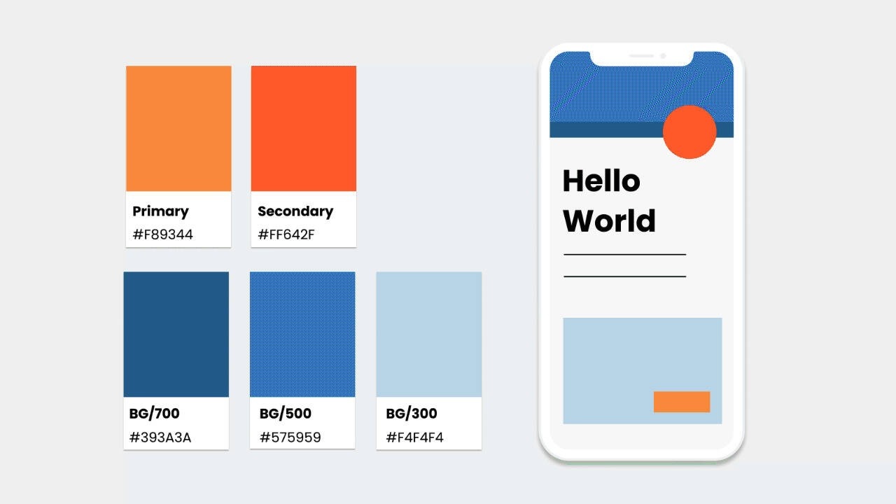
Color Values. What to use when.
Colors can be noted down in different ways, and the most common ones you will probably come across are Pantone, CMYK, HEX, and RGB. We only use HEX and RBG in screen design, but it is still essential to understand the difference as you will most likely be dealing with a brand on- and offline.
Pantone → Use for PRINT
It is an exact mix of ink, so it is the same color globally. You cannot print Pantone on your home printer but you can look at an official Pantone color book as a reference. A professional printer would get the specific Pantone for you and add it to their machine for the print. Hence, it is usually more expensive to print Pantone colors which is why it is mainly used for logos or brand elements that need to match across different media, the rest stays is in CMYK
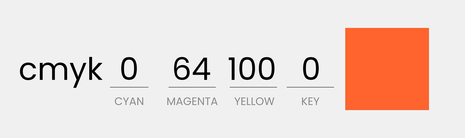
CMYK → Use for PRINT
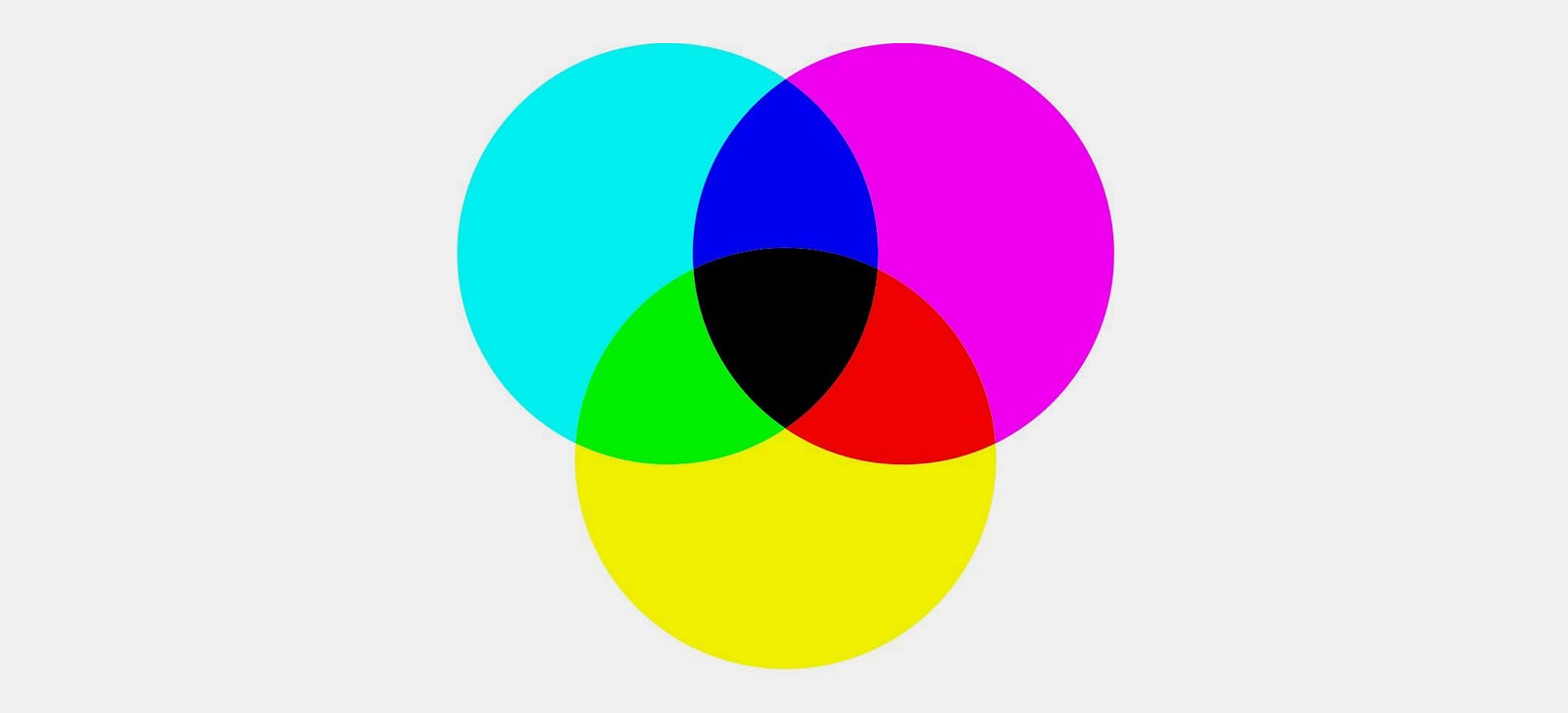
Mixing the four colors, cyan, magenta, yellow, and key (black), is the base of all other print colors. These are also the four colors found in your home printer and professional printshops.
RGB → Use for UI Design
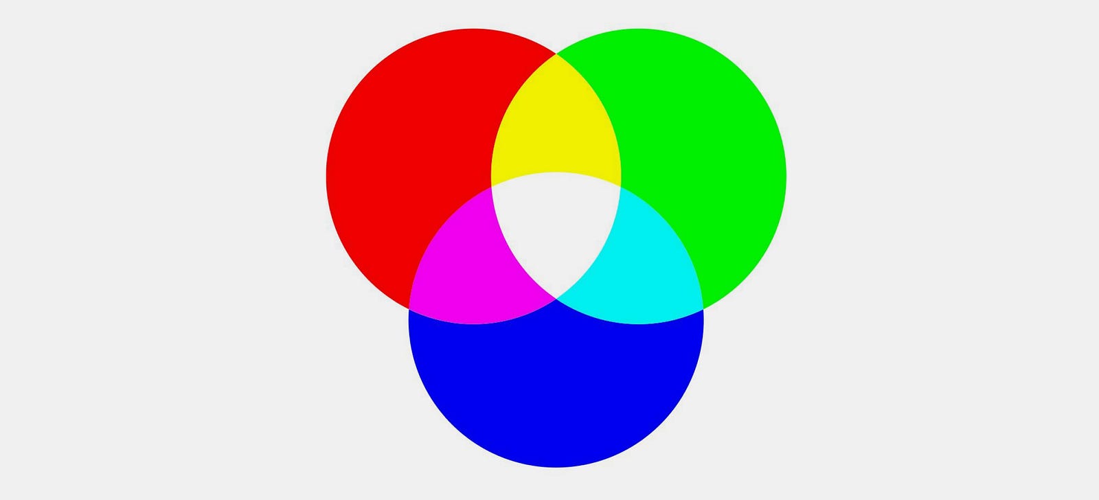
RGB stands for red, green, and blue. The monitor emits these colors, so they are made of light and not ink. The color spectrum of light is larger than print. Due to their different systems, print and screen colors will never match 100%. That is no problem as long as the palettes are harmonious within themselves. Just be aware of it.
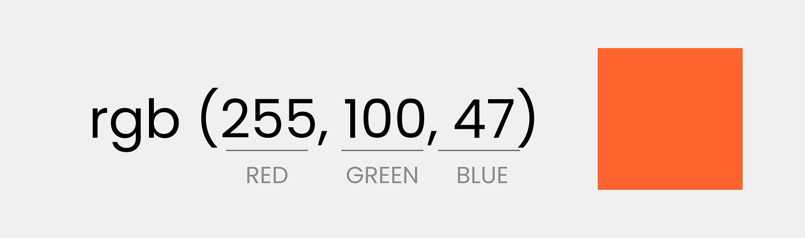
When giving RGB values in UI design, it ranges from 0–255 e.g. R= 255, G =255, B=255 or RBG=255,255,255 is white while RGB= 0, 0, 0 is black.
RGBA → Use for UI Design
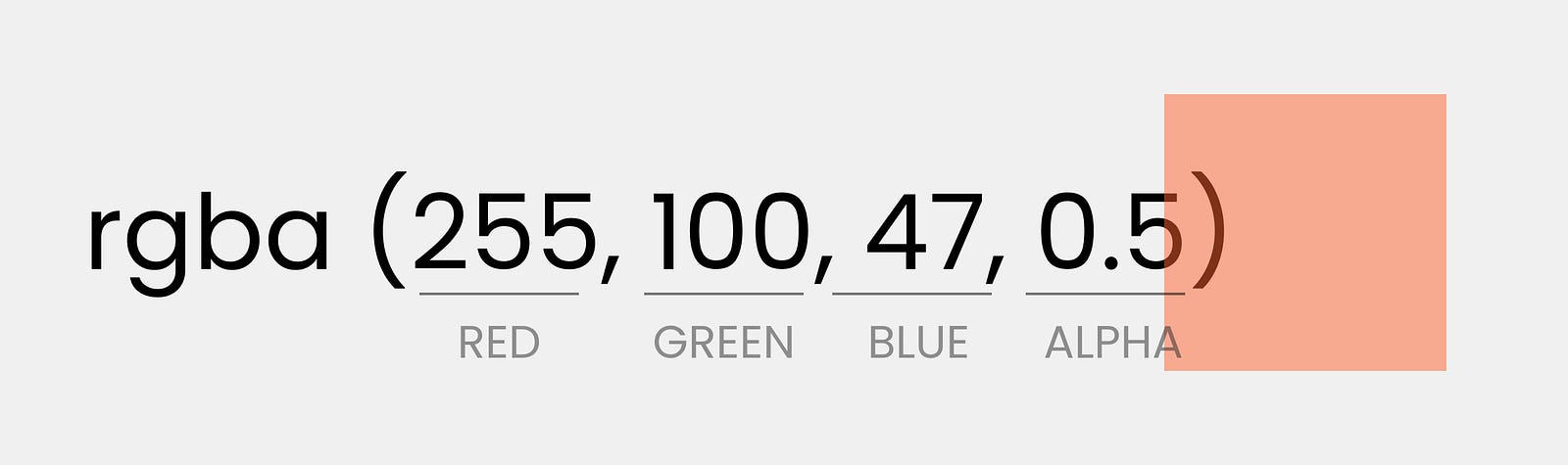
Is the same as RGB, the A stands for an additional alpha channel. Alpha regulates the transparency from 0.0 (fully transparent) and 1.0 (fully opaque).
So for example RGBA = 255, 255, 255, 0.5 would be white with 50% transparency.
HEX→ Use for UI Design 👈

Use this one! RGB is perfectly fine, but it is a little tedious to note down so HEX is just a short form of it, and it will always display the exact same color as the RBG counterpart. It is just a little easier to handle, copy, paste and share due to its string format.
Hex consists of 6 digits with a hash in front of it. The first two digits are for R, the second for G, and the third for B. This is why RGB and Hex are identical.
Note: Colors in print and screen design will never be perfectly aligned as they are created in different ways: print by mixing ink, screen by combining light. The important thing is to make each palette harmonious within itself.Converting colors between print & screen
Sometimes you might, however, be given print color to convert for your UI Design. Or you are just a very nice person and want to help the print designers with the conversion the other way around.
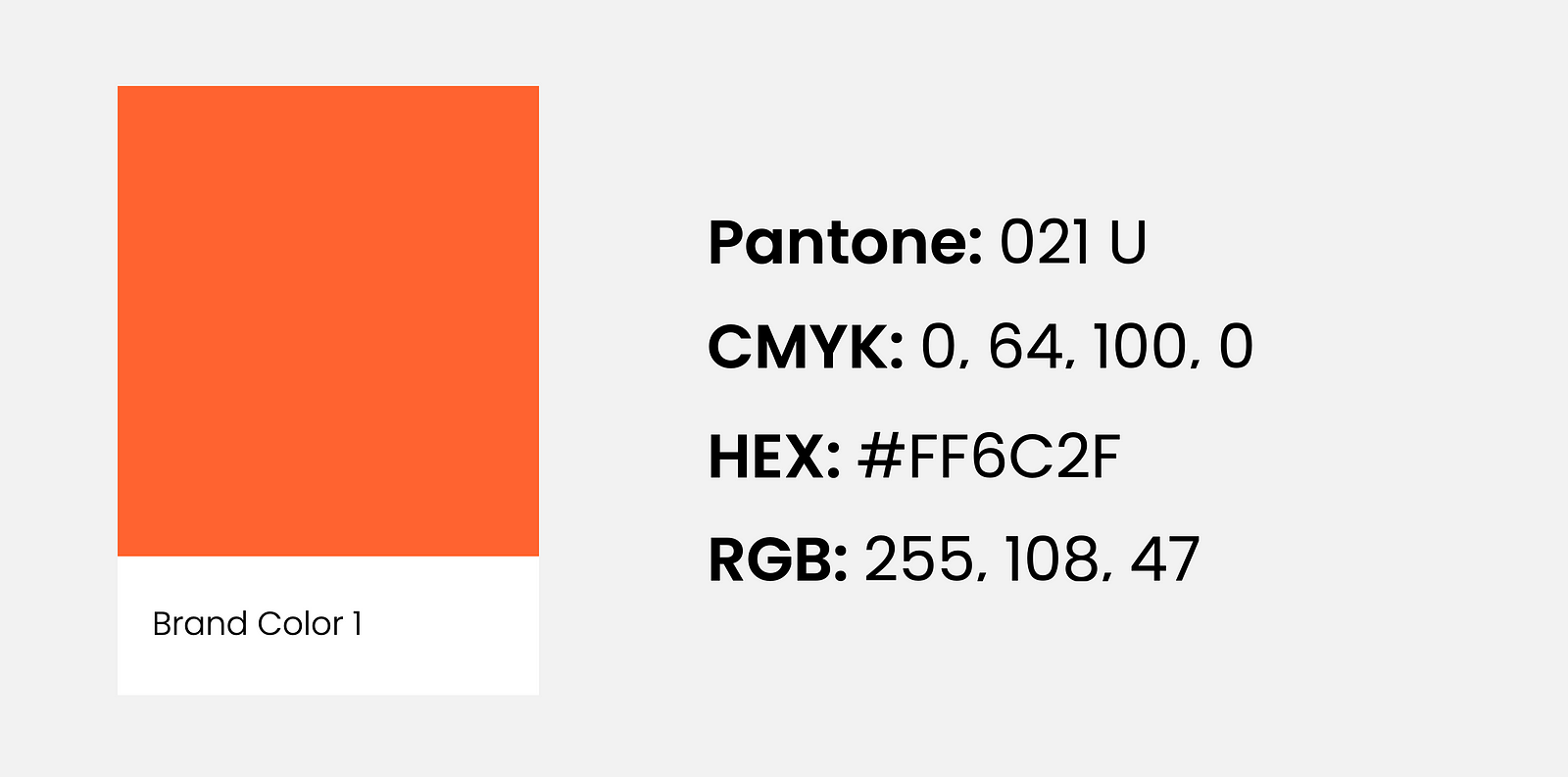
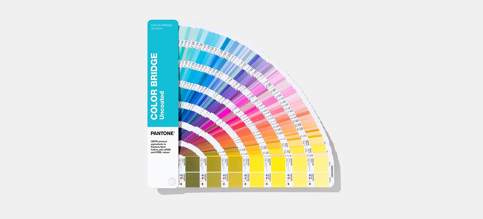
There are many online converters, but over the years, the one that stood out is the official Pantone converter that uses the so called Pantone colour bridge. To use the digital version go to the Pantone color finder page.
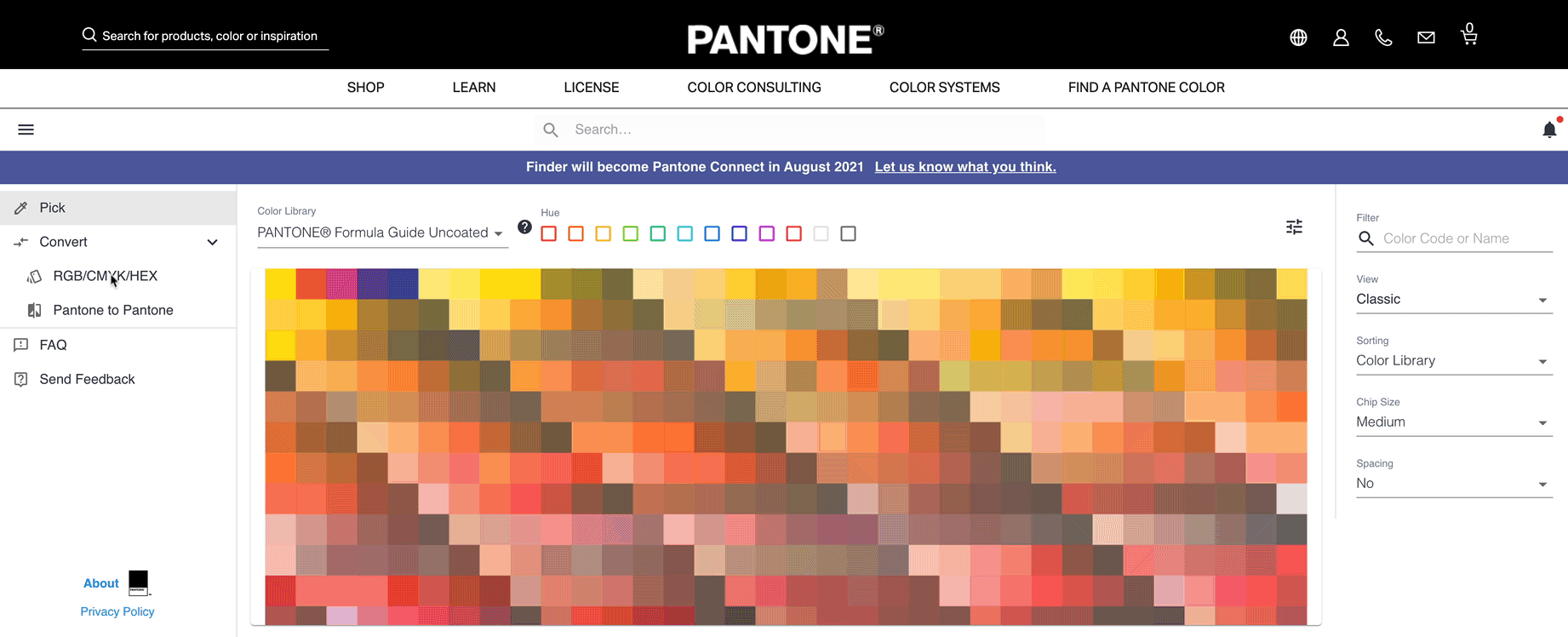
Here you can choose to enter Hex, RGB, or CMYK and will be suggested a matching Pantone. Click on it, and you will be told all associated color values. If you want to convert Pantone to Hex, just use the “Pantone to Pantone” section in the left-hand menu (yes, confusing wording indeed, but it works).
✏️ Tip: If you are converting from screen to print try to get hold of a physical Pantone swatch to compare colors before documenting. Any design team or professional print shop should have them.
How many colors in UI Design?

Even though in UI Design there are no technical limitations it's best to limit colors to a maximum of two to three.
You will still be able to have variations of those colors (more about variants later). As you will learn shortly it is much more about the combination of colors than the quantity when going for a more vibrant design.
Having said that, if you have some great idea in mind needing lots of colors then feel free to do so. The rules are there to break them.
How to choose, mix & match colors in UI Design
You might have a natural flair for picking and mixing colors. That is absolutely fine, then just go ahead and use that. However, if you are feeling a little insecure about matching colors, there are some techniques you can use.
I personally don’t believe in color associations such as blue is calming and red is vibrant as this changes with culture, it is much more about the way you combine colors that creates the mood.
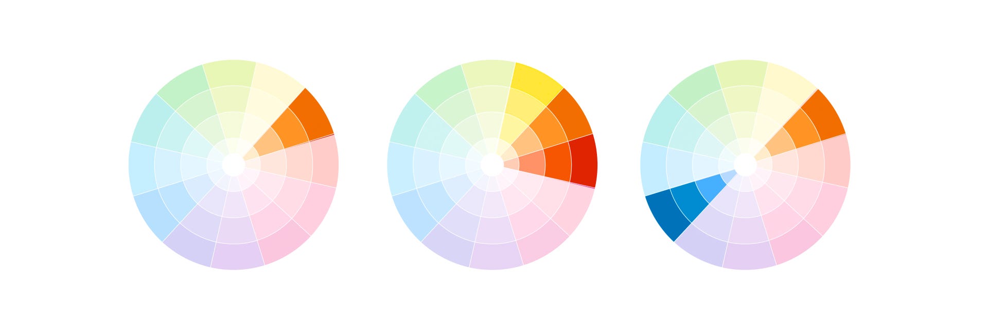
We use an RGB color wheel with its 12 color segments (made up of the so-called primary, secondary and tertiary colors). I simplified mine into sections just to make the examples easier. Usually, you will see the wheel in your design software with a soft color transition to pick colors. Adobe also has a great color wheel tool that can help you with setting up colors.
Monochromatic
Pick your color, and then walk towards the center of the wheel to get a lovely shading. This color combination creates a very subtle and sophisticated look.
Analogous
With this approach, we pick colors that are next to one another. You can move either way in the color wheel. They need to be within a 90-degree angle, and you should get a good result. This approach adds a bit more dynamic without losing elegance.
Complementary

If you are looking for something vibrant, then this is the way to go. Start with a base color and then add the complementary color from the opposite side of the wheel. You can combine this beautifully with adding more monochromatic colors
Split Complementary
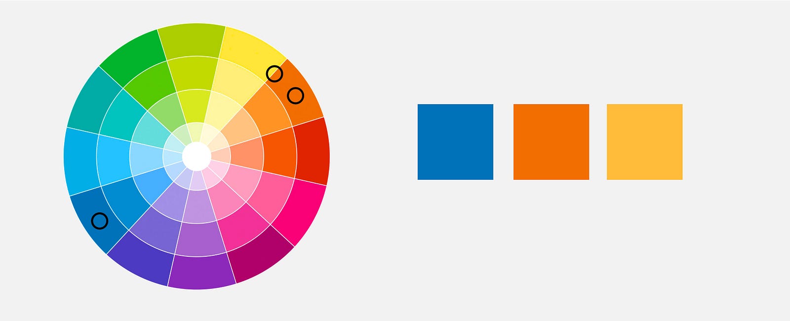
Or push even further and add an analogous color for more vibrance. This is called the Split Complementary approach.
These three approaches should help you to build your palette, there are more approaches such as the triadic and tetradic you can check out but they need a little more experience.
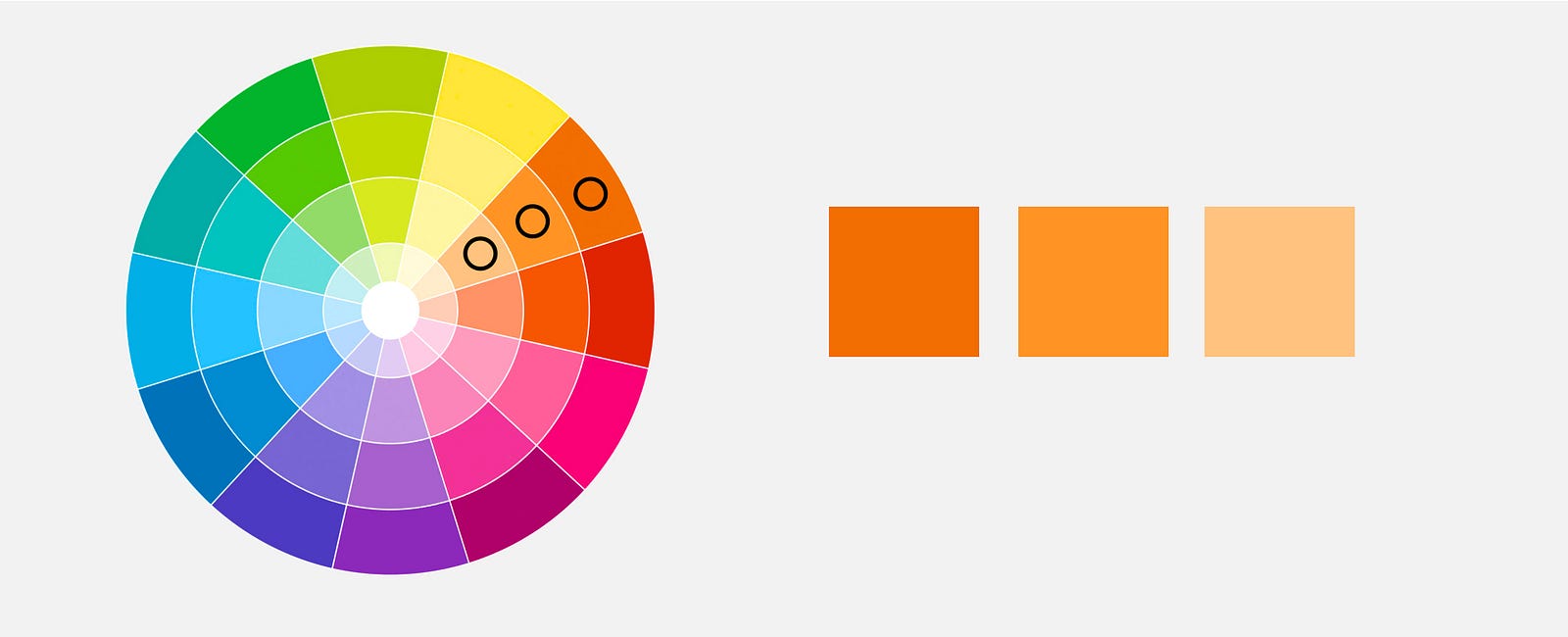
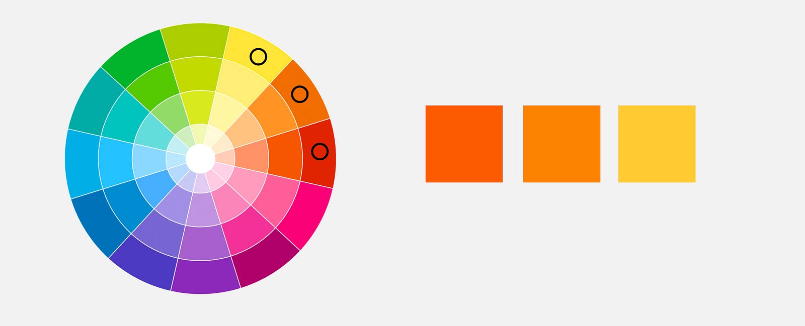
Play with it: Hue, Shade, Tint & Tone
Once you found your colors that does not mean you are stuck with only those, they are the base but you can still play with them. It is important to understand the different ways to tweak colors, just don't overdo it.
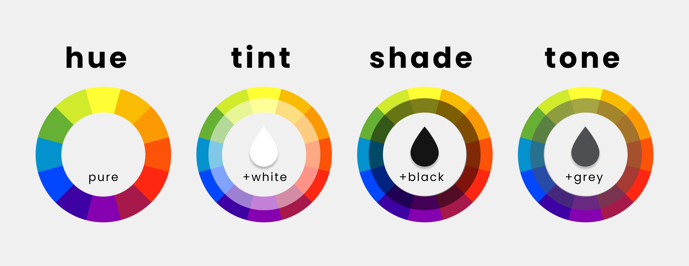
Hue → hue is the pure color, without any shade tint or tone. So if we go around the outer part of the color wheel, we change the hue.
Shade → hue to which black has been added.
Tint → hue to which white was added
Tone → hue to which grey was added
Use color variants
The colors you should really play with for some more depth are the so-called variants. You could change the hue by hand or use a tool like material design color palettes.

✏️ Note: The “P” on the circle indicates whether a text color is legible in front of a background. A white indicates when white text is legible on a background color. A black indicates when black text is legible on a background-color
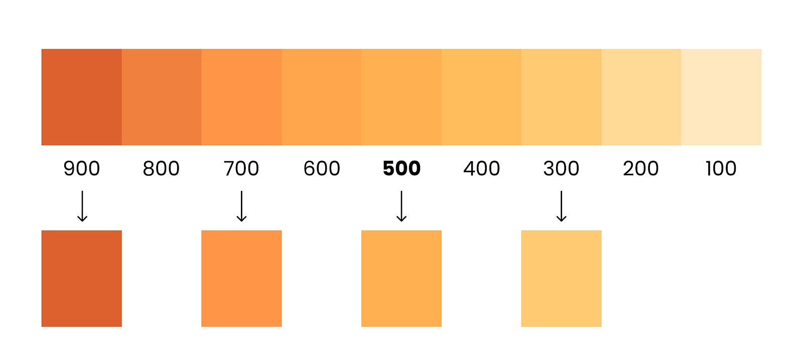
Add your hex value, and it will create the variants for you. You can use as many or as few variants as you need for your design. I usually use 3 to 5 but up to 9 are totally fine. They also do not need to be the exact neighbors, you can choose how much contrast you like for your design and just leave some out. If you are wondering about the numbers, I will explain that in the next section about naming.
Naming colors the right way
Naming colors
So once you picked your colors and variants, you would document them in a stylesheet and or your design system.
Don’t name colors after the color itself, like red and blue but to use something generic as colors might be replaced and adjusted over time.

It does not matter what names you use. They just need to be descriptive and consistent e.g. background, greys, and so on could be the called neutrals. Then you have a primary and a secondary color, whereby my secondary is my highlight color usually.
Naming Variants
Now your variants are built around the primary or secondary color. Thus they don’t get their own name, but they need to be identified as a variant usually by a number. In the material palette tool, we created them with the use steps of 100, which I also like to use. You could just as well use steps of 10, though.
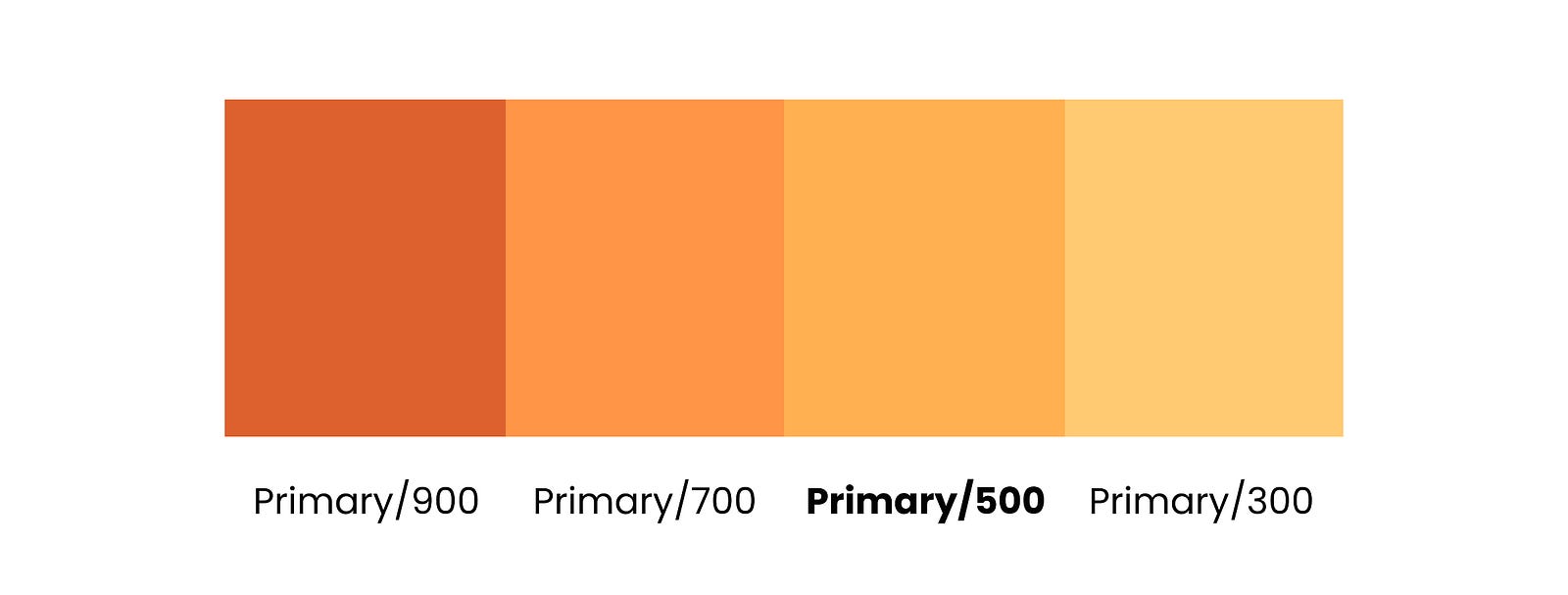
For my base color, I like using the value 500 and then create the other variants around it as I go along.
However, do not name them 1 2 3 4 and so on, the reason being that you might want to add variants in between at some later point, and then it gets messy. So give yourself some space for eventualities.
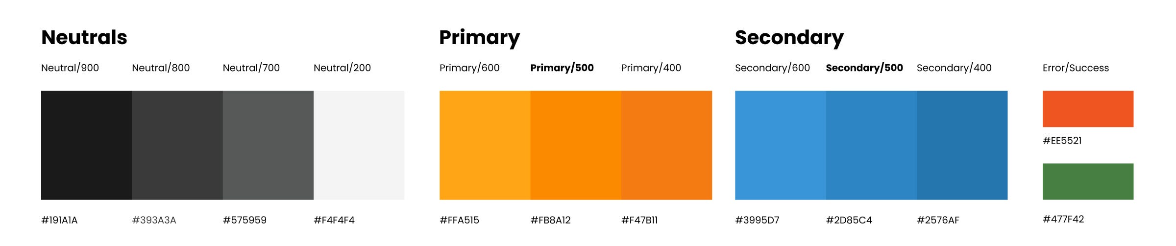
✏️ Don’t forget your system colors for error, warning, information, and success, usually red, orange, blue, and green. You can tweak them to go with your brand colors if you wish. Just make sure to keep the error in bright red, ALWAYS!
Adding an “On-color”, make it accessible!
Another thing worth adding is a so-called on-color, which means the color used on top of a color, such as typography or icons. Consciously using an on-color has two main advantages

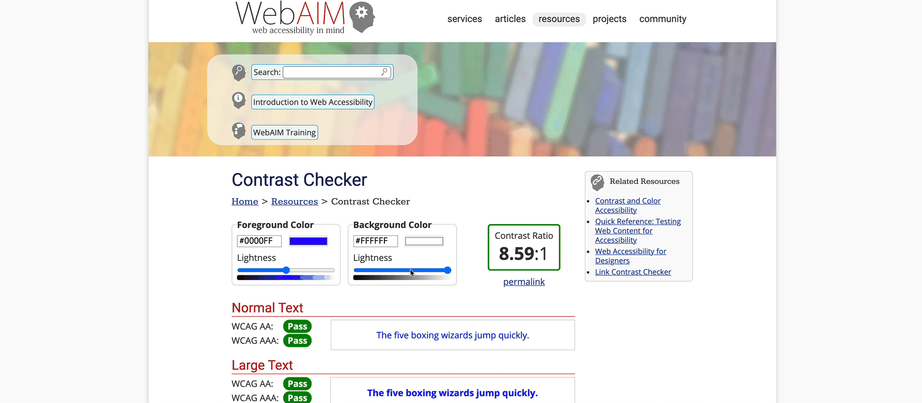
- You get reminded to check for accessibility in color contrast. Either use a plugin in your design software or an online contrast checker like this one. This is not nice to have, you are legally required to make your page accessible according to WCAG regulations.
- Let’s say your secondary is a dark grey, and you have not defined an on-color. Often, this color will be made into a variable and used as the text color too, now if you change that, let’s say, into a bright blue, then you need to change all the text in your design file and maybe even code. So keep things apart clean and simple.
60, 30, 10 Rule for color distribution
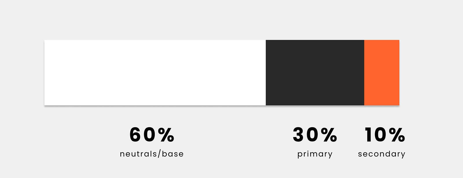
An essential part besides what colors you use is how you use them. The 60,30,10 rule is an excellent rule of thumb. It means that you use your base color for up to 60% of your design, then 30% of your primary, and just to highlight, you use your secondary color for 10%, for example, call to actions (CTA, such as buttons).
This is obviously a “feeling” of color distribution rather than an exact measurement. Color can hereby be interpreted as one color or a color and its variants. You can play with this, however, make sure your CTAs are always the same and stands out. As you can see, you get a pretty solid base and really give attention to your CTA

Learn UX/UI online anytime, anywhere
Stay connected with news and updates!
Join our mailing list to receive the latest news and updates from our team.
Don't worry, your information will not be shared.
We hate SPAM. We will never sell your information, for any reason.
