Truly Fluid Typography
Oct 24, 2019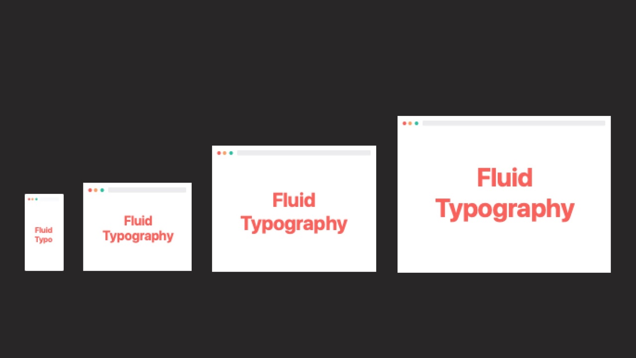
Let us talk about viewport units: You are probably used to setting typography manually within breakpoints, which usually leads to a somewhat bumpy result. Fluid typography using viewport width (“vw”) automatically adjusts the font size to the width of the screen. Today we have a countless number of devices with different sizes and fluid typography helps you to create a more harmonious design, regardless of screen size. It also gives you infinite design flexibility when combined with new grid standards such as CSS Grid.
All vw is, is a percentage of the screen width. So:
1vw = 1% of the viewport width
e.g. the viewport is 1400px wide, so if we set the font to font-size: 8vw this would be 1400px * 0.08= 112px font size
There are also vh (viewport height) vmax and vmin, but we don’t need them today, just be aware of their existence.
1. Basic approach: font-size=vw
You can use vw as a direct unit like px or em. Let’s see how this works with an example:
h1 {font-size: 4vw;}
So that’s basically what it does. It simply calculates the font size for each width. At 1000px width the font is 1000px * 4% = 40px
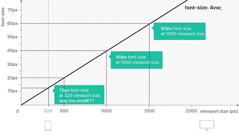
However, especially with larger vw values, the font quickly gets out of control and becomes too small for mobile devices and too large for desktop screens. No problem, we can fix it with a simple media queries. You can calculate the breakpoint as follows:
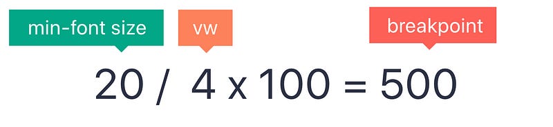
To find the viewport size (and thus the breakpoint) at which 4vw equals font-size:20px;, I simply calculate: 20/4*100=500. So I only want to activate my vw units from 500px and fix everything at the bottom. Then simply do the same for max-width if you need it.
// Base and fixed size for all small devices
h1 {
font-size: 20px;
}
// Fluid size for all screens, larger than 500px
@media (min-width: 500px) {
h1 {
 font-size: 4vw;
}
}
// You can do the same for a maximum size if you wish
@media (min-width: 1500px) {
h1 {
    font-size: 60px;
  }
}
So this is basically what it does:
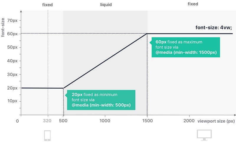
Done! So this is the most basic, quite a lot to type, yet very solid way to use vw to make your font more fluid.
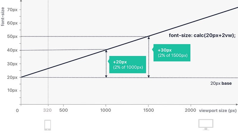
2. advanced approach: implementation with calc()
with SASS or similar you can also use calc() to control the growth rate a bit more. So all we’re doing here is basically choosing a base size (20px in this example also works well with em, try it!) and then simply adding the percentage of change on top.
h1 {
 font-size: calc(20px+2vw);
}
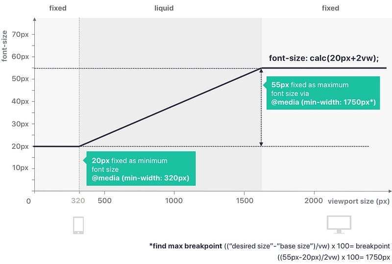
Depending on font-size and project needs, you might want to specify the minimum and maximum size as well:
// fix base and smallest font size
h1 {
 font-size: 20px
}
//fluid font from 320px onwards
@media (min-width: 320px) {
 h1 {
  font-size: calc(20px + 2vw);
 }
}
//fix font size for large screens. Calculate this point
@media (min-width: 1750px) {
 h1 {
  font-size: 55px;
 }
}
A step further: Adding even more control
You can add even more control over the exact rate of scale with calc with this technique by Mike Riethmuller. You will get more details in this article. The basic idea behind this is that you set your minimum font size and your maximum font size and also determine your desired screen size max and min and perfectly distribute the font in this area. You generally let it choose the perfect vw instead of passing it. However, you still need to add media queries that many examples simply ignore. It is a good approach if you are looking for a high degree of control and are willing to add some extra time and lines of CSS.
3. Pro Approach: SASS Mixin magic!
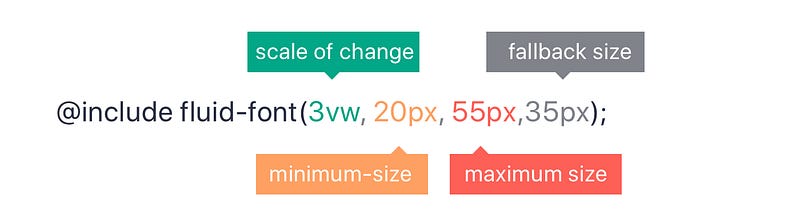
I came across this fantastic solution by Eduardo Boucas on CSS Trickswho created a SASS mixins that you can simply add to define minimum font-size, maximum font-size and a fallback (never to ignore!). What I love the most is that you can save the mixin in a separate file and then simply add this line to your layout or component file. Keeps your file nice and tidy.
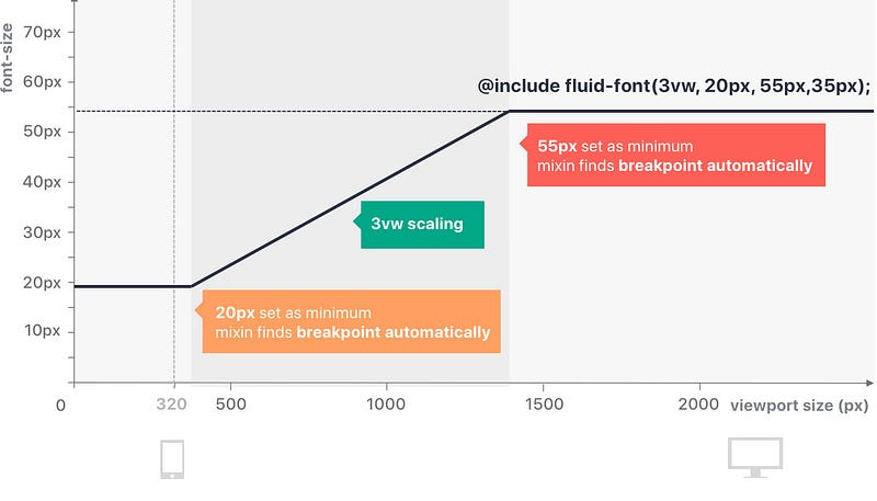
h1 {
 @include fluid-font(3vw, 20px, 55px, 35px);
}
So in this example we declare the font as liquid with 3vw (as you know, the larger the number, the faster it grows), but set a minimum font-size of 20px and a maximum font-size of 55px with a fallback of 35px for non-supporting browsers. The mixin calculates the breakpoints for me. Playing around with font sizes and scaling rates is also very easy.
So this is basically what it does:
this is the complete mixin that works in the background, just copy and paste into your SASS and you’re ready to go.
@mixin fluid-font($responsive, $min, $max: false, $fallback: false) { $responsive-unitless: $responsive / ($responsive - $responsive + 1); $dimension: if(unit($responsive) == 'vh', 'height', 'width'); $min-breakpoint: $min / $responsive-unitless * 100;
@media (max-#{$dimension}: #{$min-breakpoint}) {
 font-size: $min;
}
@if $max {
$max-breakpoint: $max / $responsive-unitless * 100;
@media (min-#{$dimension}: #{$max-breakpoint}) {
font-size: $max;
 }
}
@if $fallback {
 font-size: $fallback;
}
font-size: $responsive;
}
To be taken into account when using vw units
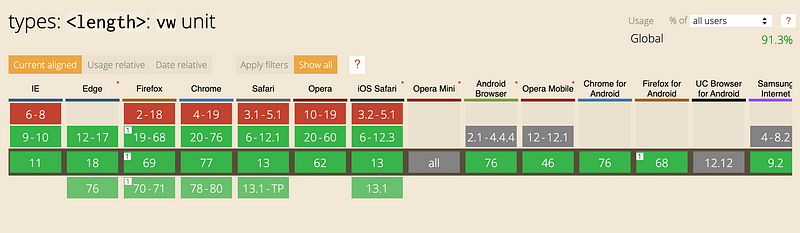
- Browser support and fallback: Browser support is pretty solid (91.3%), but if you’re dealing with a key element like typography, you definitely need a px fallback. You can simply add one simply like this:
h1 {
font-size: 20px; //fallback
font-size: 2vw;
}
Learn UX/UI online anytime, anywhere
Stay connected with news and updates!
Join our mailing list to receive the latest news and updates from our team.
Don't worry, your information will not be shared.
We hate SPAM. We will never sell your information, for any reason.
