Figma: All you need to know
May 20, 2021
This tutorial is for you if you are starting with Figma from zero, switching from graphic design to UI, or if you are (like me) switching over from Sketch. If you are looking for more advanced Figma tips and tricks click here.
For the past years, I have loved Sketch with all my heart, and I am still a great fan. However, when it comes to team collaboration and hand-over, a painful jumping and updating between Dropbox, Abstract, Craft, Zeplin and InVision started. Whatever combination I used, it ended up slightly messy and caused extra cost. Prototyping is also a little clunky. Figma promised an end to all of this and did not disappoint.
Advantages:
- It’s free!!! (for up to two users and three projects per account)
- Runs on Mac and PC ( Sketch only on Mac)
- Real-time team collaboration,
- You can import Sketch files (but beware, you cannot export to Sketch!)
- Integrated Developers hand-off/Specs for Mac and PC 🥳
- Fantastic Team library/Design Systems, a single source of truth
- Integrated high-quality prototyping
Disadvantage:
- You need to be online to work. However you can save a file locally, work on it and add it again later.
1. Getting Started
1.1 Get Figma
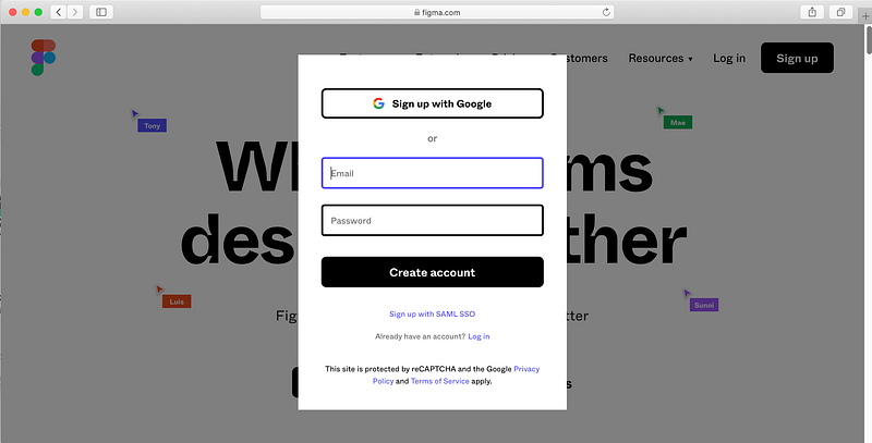
Go to figma.com, sign up and follow the instructions. A minute later you are ready to start…wow!!!
You might notice that Figma lets you create teams and projects, I will be covering later, for now just make a new file anywhere(from the menu or cmd+N) for a quick start. You can move files later.
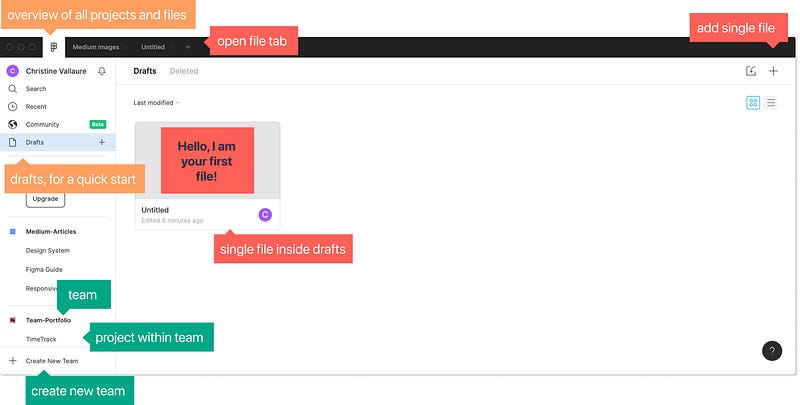
Unlike Sketch, Figma’s files are not stored locally on your computer but cloud-based. You can access all your work through the browser, anytime, anywhere. There is a Figma App for Mac and PC I recommend using, but you don’t necessarily need it.
Downside: You need internet. However, you can download the file to the app beforehand to work offline.
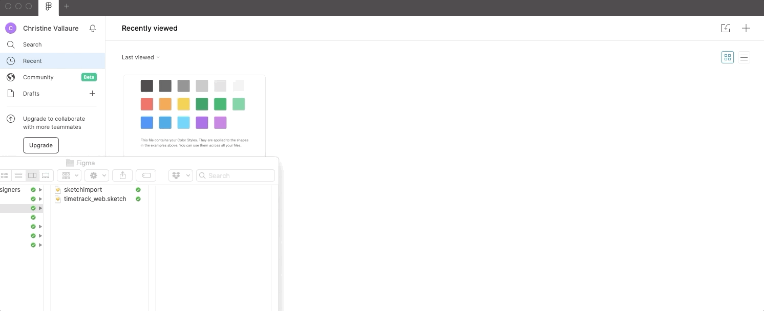
1.2 Importing old Sketch files
Figma lets you import Sketch files quickly and accurately. Simply drop the Sketch file onto the Figma canvas. Done! You will find all layers and setup in place.
Downside: You cannot copy and paste single items from Sketch to Figma (you can, but they will be converted into an image). So even if you just want a single button, you need to import the whole file from Sketch.
Update: Thanks, Sevikpar, for pointing out that you can copy single items from Sketch if you right-click them and copy as SVG!
☝️ Tip: I recommend downloading the Figma App when importing from Sketch as you will not be able to render local fonts in the browser and it messes up your file.
2. Designing with Figma
2.1 Setting up new frames (aka artboards)
If you used Sketch, this will all be quite familiar to you. Press A or F to see all frame options in the properties panel on the right-hand side and pick the size you wish to work with or simply draw your own frame. As in Sketch, you can work at 1x (meaning the actual pixel size) as there is no quality loss when resizing. You can still export assets any larger size you might need.
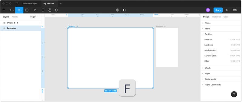
Unlike traditional artboards, you can nest frames within each other. This allows you to create more complex designs that interact with each other. More about this later.
2.2 Grid and layout columns
For mobile, you can use a standard 8 point grid. For Web, it’s less about spacing and more about layout grids so you can start on the safe side with a popular 12-column bootstrap grid. Or a little more modern with my personal favourite, a custom CSS Grid. Best talk to your developer beforehand and agree on which setup you will be using.
Adjust the grid in the grid properties menu on the right-hand side. You can switch from grid to columns or rows and also make it fixed or fluid and set margins and gutter to your needs.
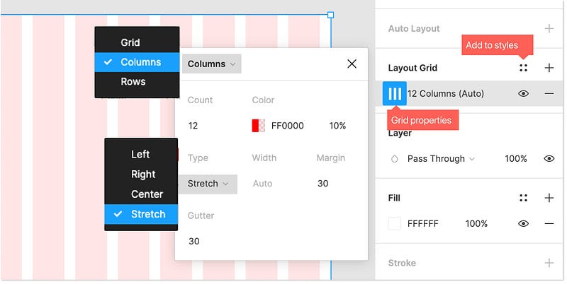
The great thing about grids and columns in Figma is that you can set up multiple grids and store them in your styles (we will talk about styles in-depth later). This is a handy feature for adapting your layouts to a range of devices, share them with team members or simple re-use them in other projects.
☝️ Tip: Toggle visibility with ctrl+ G.
2.3 Layers and groups
As with Sketch, on the left-hand side of your screen, you find the layers panel.
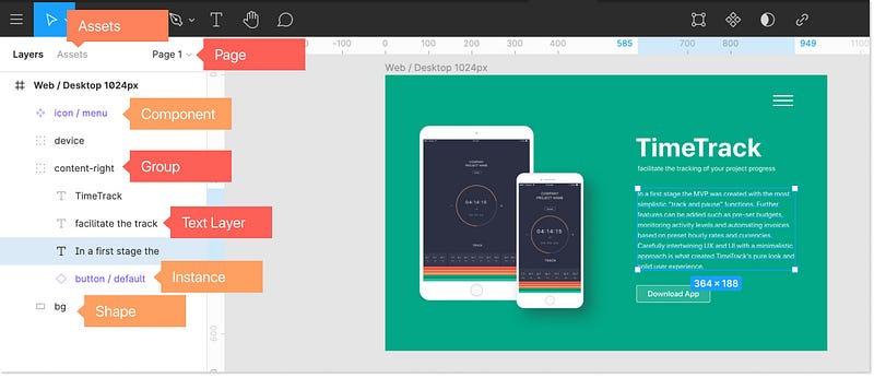
- Layers → every new element your add creates a layer automatically. You can rearrange layer by drag and drop.
- Group layers → Make sure to group layers (select layers and press cmd+G) to keep your file organized. It also helps you to quickly move and copy those groups across frames. To select an element within a croup press cmd and click on the item.
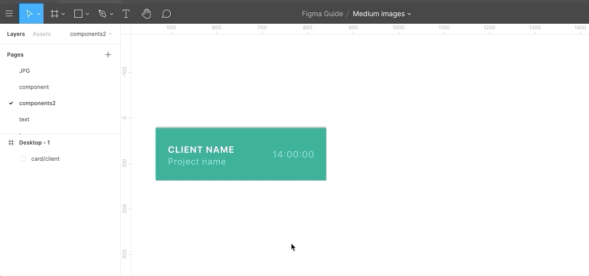
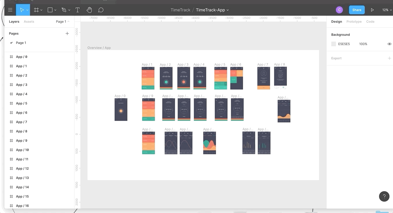
- Pages → You can set up different sections or areas of your design. Ther are no rules on what or how to use them. I usually have separate pages for messy brainstorming, wireframing and interactions up to the final version.
- Assets → Yourcomponentsare kept here, and you will find your library button in this section (more about the library, components and instances at a later point)
- Nested Frames → In Figma, you can also nest frames. This comes in handy when structuring and prototyping.
2.4 Vector shapes
Figma uses something called Vector Networks, allowing the creation of complex shapes. Bye-bye Illustrator!
For default shapes, pick from the top menu or simply hit R(rectangle) L(line) or O(ellipse) and start drawing your shape. Hold shift to keep proportions in place. Each shape automatically creates its own layer.
To make your own, more complex shape, hit P, or pick the pen from the top menu. Once finished, simply press enter. No need to connect and close paths! Nice! You can change properties and manipulate vector shapes at any moment during your design process via the properties menu on the right-hand side. Vector Networks are very powerful if you want to know more. I recommend this in-depth tutorial from Design+Code.
☝ ️Note: In case you are new to this, vectors are scalable and exportable at any size yet remain small in file size. They are ideal for simple shapes, buttons, icons, logos and all sorts of simple illustration.
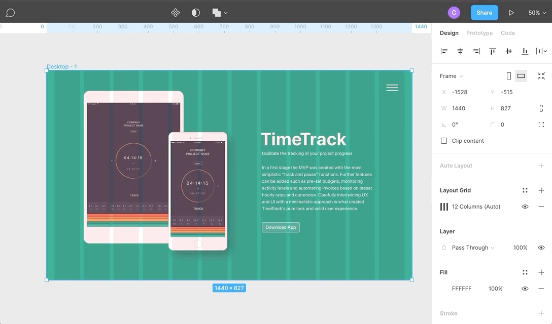
2.5 Images
Drag the image onto your work area. If you are used to Sketch here is where you need to adapt to a new format. In Figma, images are always placed inside a shape (like a mask). To change the behaviour of the image go to Fill on the right-hand properties window and open the image properties.
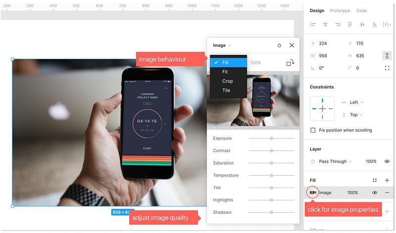
In the dropdown you can choose:
- Fill → Image will fill the container.
- Fit → As we resize image will never be cropped or hidden
- Crop → Crop the image to the size and selection you need. Note, you don’t lose the rest of the image as in photoshop, you are only masking the image.
- Tile → Repeats the original images as necessary, and you can adjust the size of the tile.
Furthermore, Figma allows adjustment of properties such as colour and saturation. Note that they are always re-adjustable and you will not lose the original image properties at any time.
☝ Note: You can also fill an existing shape with an image. Click on the shape, go to “Fill” and from the dropdown choose “image” where you would otherwise set a colour.
☝ Note: If you are new to this, be aware of the fact that you need to own or buy the rights to the images you are using. You can also use license-free images, my favourite page is Unsplash, amazing images at top quality and they even have a Figma plugin.
2.6 Typography
Figma comes preloaded with google fonts, which are fantastic! In case you prefer using local fonts, you either need to install Font Helper or the Desktop App for Figma. Also, make sure everyone else accessing the file has the same fonts installed.
Press T, to draw a text window or simply click and start typing. You can set all text properties on the right-hand side properties menu.
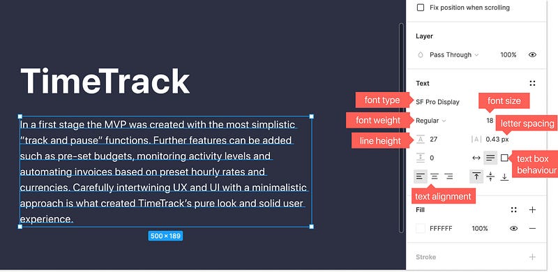
Text box behaviour such as auto width, auto height and fixed-size will be relevant once we talk about auto-resizing later.
☝ ️Tip: If you are new to web and app design, make sure your copy text is never smaller than 16px, better aim for 18px. Depending on your font, I also recommend adding a bit to the line-height for better readability.
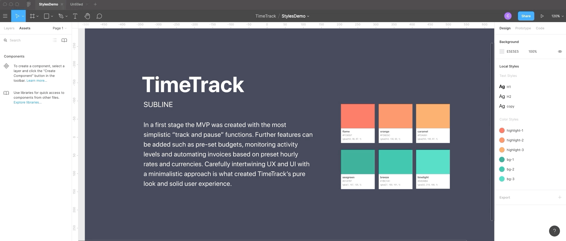
3. Styles
Styles let you save and re-apply properties. In this way, huge files can be updated in an instant. Styles can be created for colour, text, grids, and effects such as shadows.
To see all used styles, click on the grey background next to the frame and they will be displayed in the properties menu on the right
3.1 Create colour styles
Colour and gradient styles in Figma are fantastic as you can set up one style and re-use it on text, fills and outlines! You can change and delete styles at any time during your design process by right-clicking onto the style.
Create and use a colour style:
- create a shape
- Change the fill to the colour value you want
- Click on the square symbol containing colour styles
- Click on “+” to add the class. Done!
☝ ️Tip: when naming colours, its good practice to call after the use and not the colour itself. Eg. Use “highlight colour” instead of “orange”.
3.2 Create text styles
Unlike Sketch, text style properties in Figma only store the font family, size, line height and spacing. This keeps your styles library nice and short as there is no need to duplicate a style for another colour or alignment version of itself.
Setting up a Text style works pretty much the same way with colour styles:
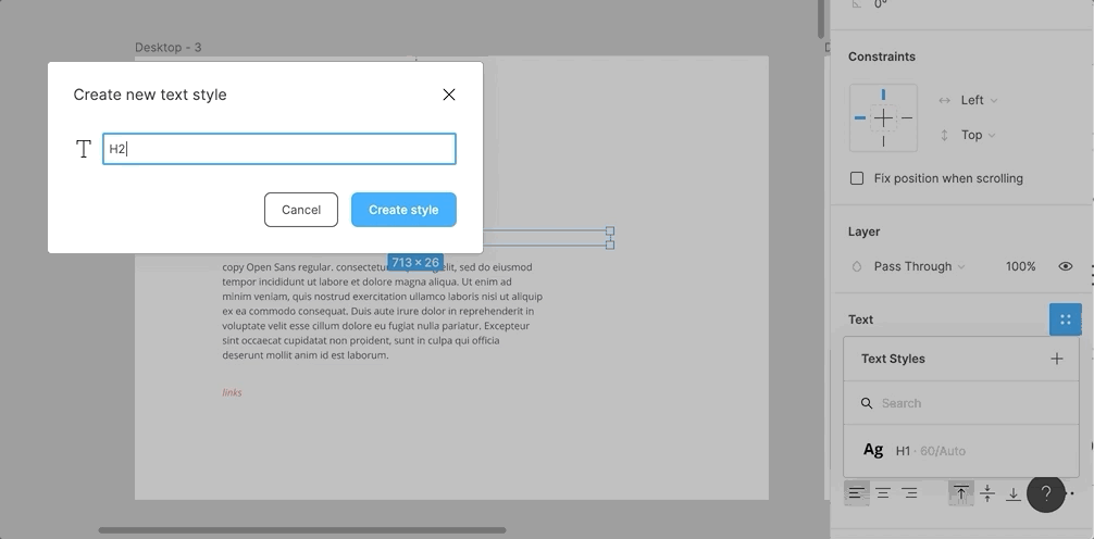
- Click on the text you want to make into a style
- On the right-hand properties menu, click the styles square icon
- click on + and give your style a name
- To add a style to an existing text, just click on the text and then pick the style you want from the right-hand menu via the styles square.
Once you added a style, you can also alter the properties or detach the style via the same menu.
☝ ️Tip: when naming text styles, it is best to call after use, e.g. “H1” or “paragraph” “quote” rather than a specific description about font or size. In this way, you can always adapt fonts without re-naming.
3.3. More Styles
Figma does not stop there. Grids can also be saved, shared and re-used as styles.
Furthermore, effects, such as drop shadow, inner shadow, layer blur and background blur:
4. Components
components are UI elements, that can be re-used across your design files. Components make your design (and later programming) consistent and allow for easy updating and scaling and will save you a lot of work!
4.1 Creating reusable components
- select the object and press the create component button at the top of the screen or cmd+alt+K.
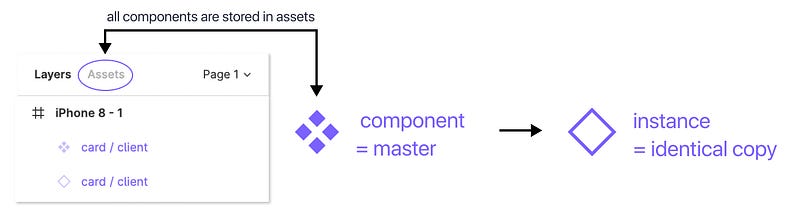
- In the layers panel, you will then see the purple component icon. You created a master component.
If we now make a copy of this master component, it automatically creates an identical copy, called an instance. Any changes in the master component will result in the same changes being made to all instances.
You find all your components in the Assets tab next to Layers on the left-hand side and can also drag them onto the frame.
☝ ️Tip: In the long-run, you should aim to align your Figma components with your front-end components (e.g. components in ReactJS). Best talk to your programming team to align.
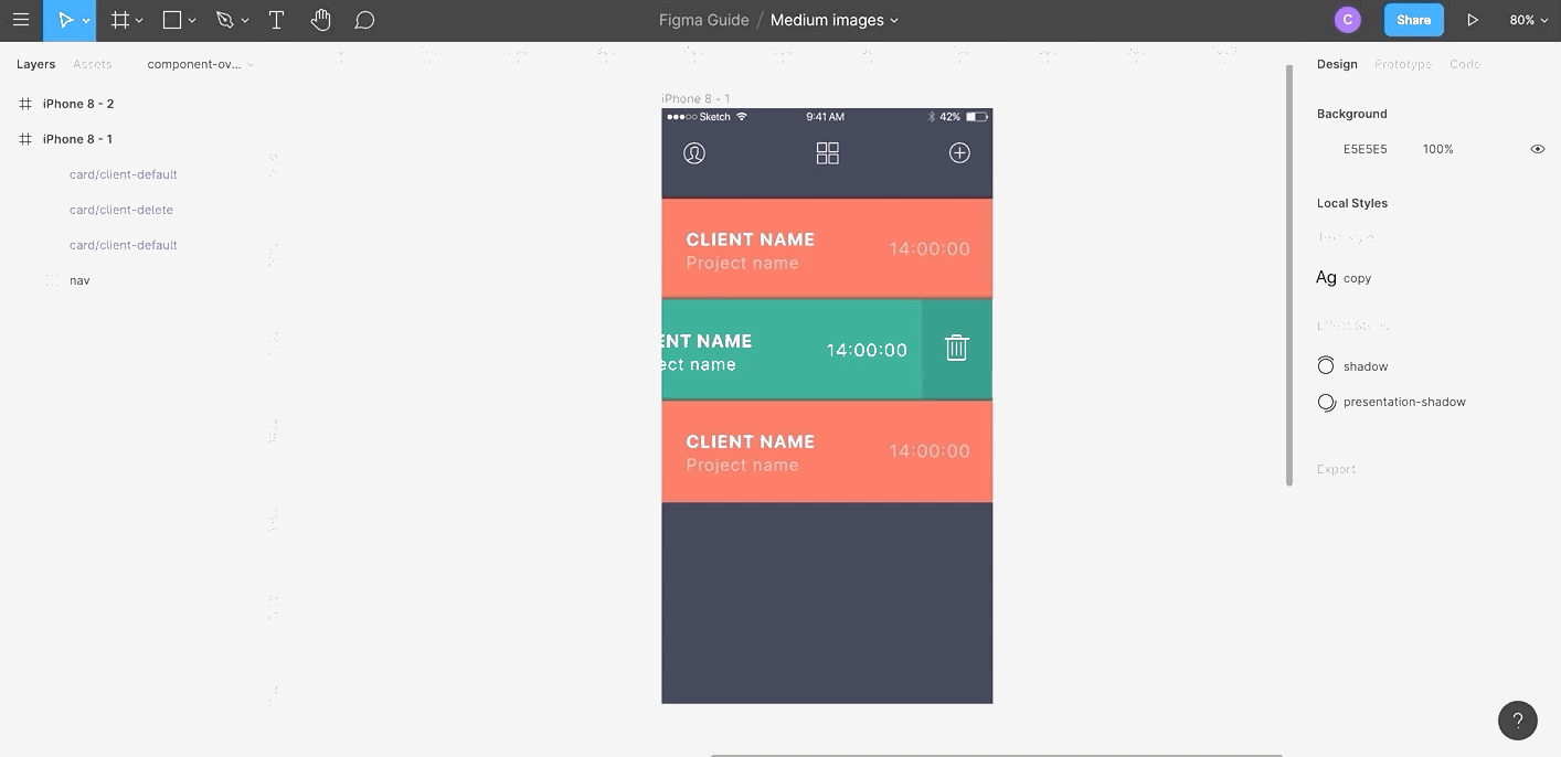
4.2 Swapping and nesting
Instances of components can be nested inside of master components. Meaning you can have components, inside of components, inside of components (if you watched Inception you get what I mean).
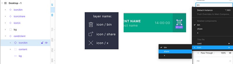
You can swap nested instances by either using the right-hand side instance swapping menu or simply hold cmd+alt+option and drag and drop them from the assets overview or your team library.
4.3 Overwrites
The instance will always follow the master component in size and general layout, but you can change properties of the instance such as colour, text, and outlines.
Note the revert button in the right-hand properties menu in case you want to reset it to its original state. You can also detach an instance with right-click on the instance.
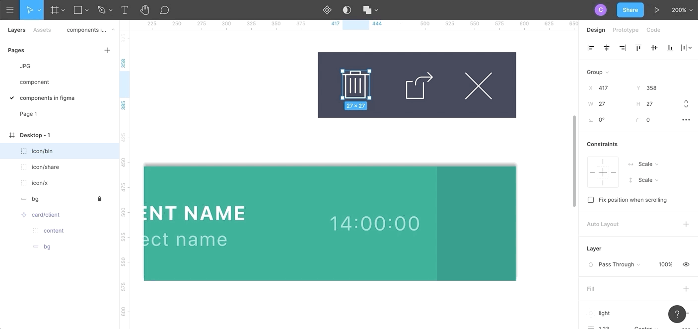
4.5 Naming components
As in Sketch use “/” to name components, e.g. change “share-icon” to icon/share. Figma will automatically create a parent category called icon which will make swapping instances and exports a dream come true!
By the way, if you have Master components on multiple pages, they will be organized by page.
☝ ️Tip: To keep your components nicely organized, make a new frame for each group, e.g. “buttons” or “forms”. Now drag your master components on there, you will find that in your components overview you find everything organized alphabetically.
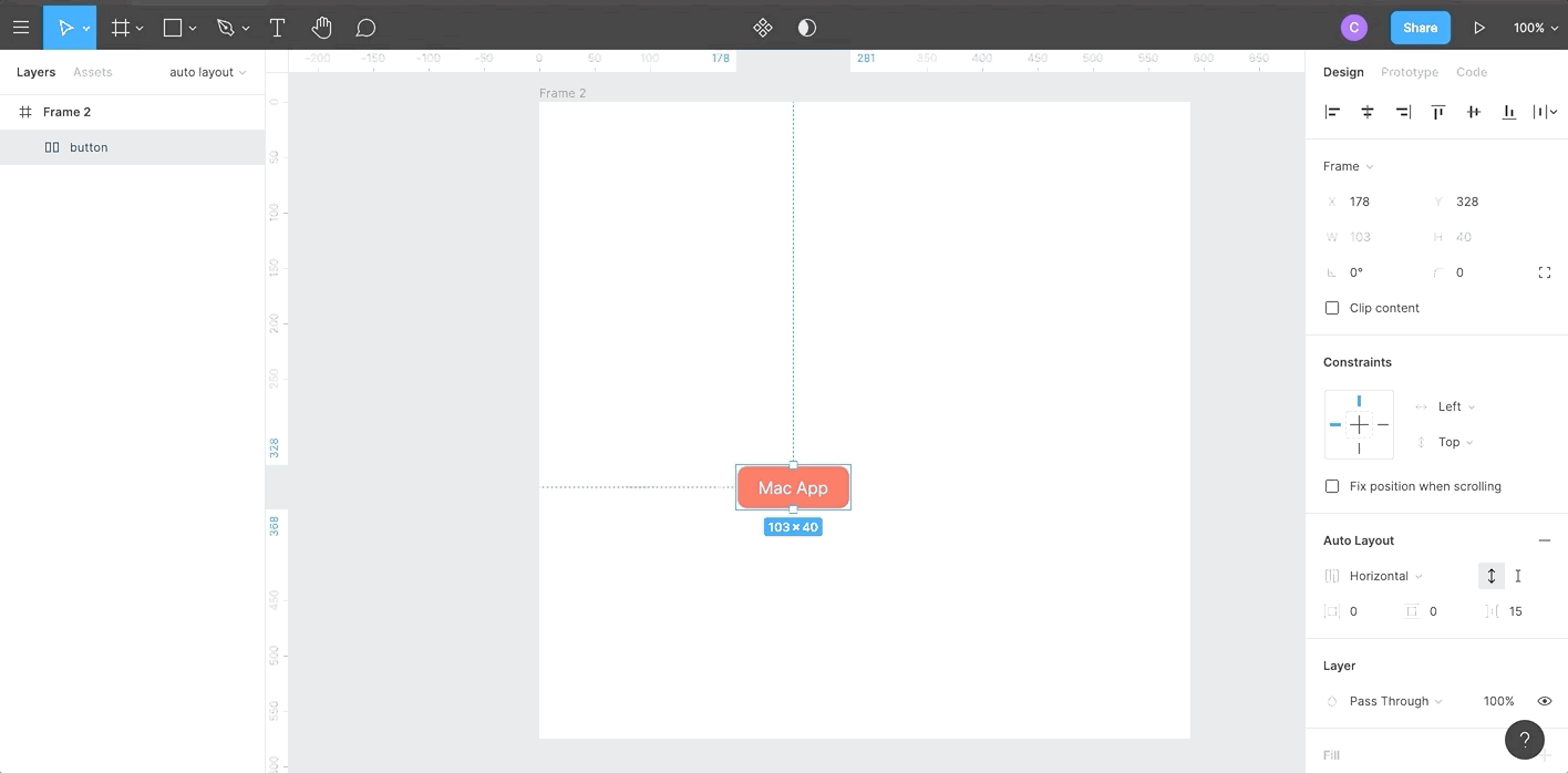
5. Auto Layout
Auto Layout allows the creation of dynamic frames that grow or shrink as you change the content within them. This is a vast improvement as it saves you tons of time re-adjusting and will also let you check if your design works well with real content in one click.
5.1 Change layers into auto-layout
- type your content
- shift+A will automatically create a new auto layout frame around the text layer with vertical and horizontal padding. You can adapt those values in the right-hand side auto-layout properties menu.
- Now change the content, and you will see the button automatically resizing.
5.2 Nested auto layout
Auto-layout frames can be nested, combining horizontal and vertical layout properties to compelling interface design.
- Select the objects, click shift+A again, the auto-layout frame is now a child frame inside a parent frame.
You can choose vertical or horizontal distribution and white space on the right-hand properties menu. To prevent text frames from growing in one direction, make sure you choose fixed with or height.
☝ Tip: you can swap positions of child frames in parent frames by merely moving the layers. Pretty nice feature
☝Note: Any auto-layout frames can also be saved as components. However, scrolling overflow will not be working on auto-layout; this is relevant for prototyping. You can use a trick around this, by putting the auto layout frame inside a regular frame.
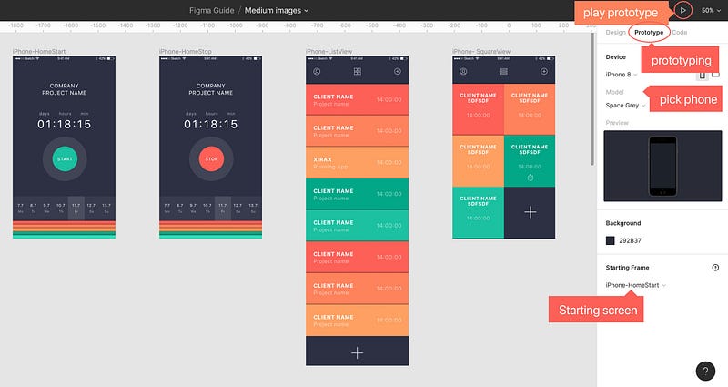
6. Prototyping in Figma
Figma has fantastic prototyping for your web and app design. You will not need any other tool on top.
6.1 Setting up a prototype
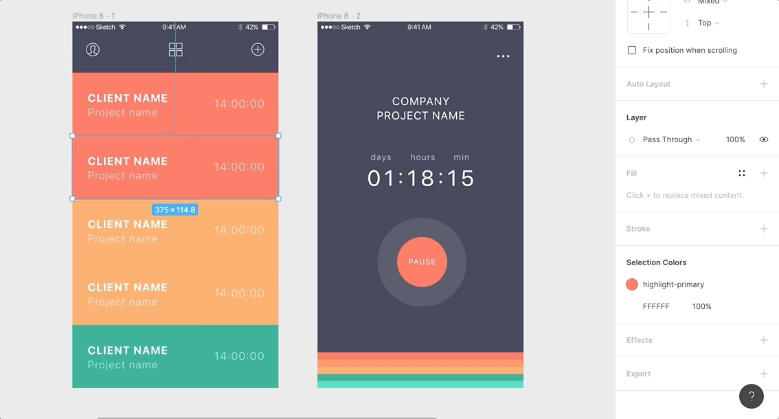
Select a frame, and on the right-hand side, properties menu click on “Prototype”. Click on “Prototype Settings” and pick the device you are designing for. Now hit the play button on the top right hand to see your design in action. You can also download the Figma Mirror app onto your phone to live preview on your device.
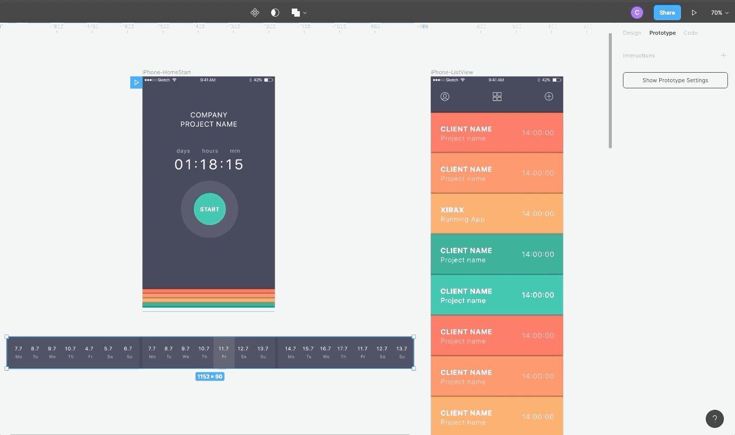
6.2 Connecting screens
Make sure you are in the Prototype menu on the right-hand side. Note how the selected element has a blue frame around it with a little blue circle. Click and hold that circle. If you drag, you see a handle appearwhich you can connect with another frame.
In the properties panel on the right-hand side, you can choose the action (swipe, click, mouseover etc.) and the animation type (move in, push in, slide out etc.)
6.3. Overflow Behaviours
Besides vertical scrolling, Figma offers other very realistic overflow behaviour.
- Horizontal scroll → Select all elements and group them. Now draw a frame of the desired size move or copy the group inside, leaving the overflow hidden. In the dropdown, select horizontal scrolling.
- Panning like google maps, → Draw a frame and add an image. In the overflow-behaviour choose horizontal and vertical scrolling.
- Fix elements → To make the header or buttons sticky, make sure to have “fix position” selected (in Design > Constraints at the right-hand properties menu)
6.4 Smart Animate
Smart Animate looks for matching layers recognize differences and animates layers between frames in a prototype. This lets you create powerful prototypes. It is, however, a little more advanced than this tutorial and I recommend you dive into this video from the Figma team. You will most likely not need any additional prototyping tools once you master Smart Animate.
7. Sharing & working with others
7.1 Presentation mode
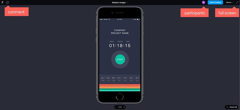
Press the play icon on the top right corner of your menu to open the presentation screen on a new tab, allowing you to click through all frames. All prototyping is included, and for mobile design, it will add a device. It comes with a comment and full-screen mode, as well as an easy sharing link.
7.2 Create a Team and Project
Teams on Figma allow collaboration with others or simply structure your work. You can invite members, add projects and store specific libraries.
To create a team simply hit the “create team” button on your Figma overview and follow the instructions. Note that with different payment plans, your teams become more powerful.
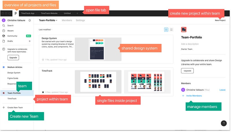
- Team → a team of people, e.g. designer, developer, copywriter etc.
- Projects → Keep related files together.
- Files → single design files, here is where the actual design happens
☝ Note: You can move files between projects and teams at any time.
7.3 Library
When working in a team, we want one particular place holding the latest update of all components and styles that all team members have access to — a so-called single source of truth. The Figma team library handles this amazingly well and will be the backbone of your Design System.
☝ Note: Design Systems are an essential part of UX/UI nowadays, worth spending some time getting familiar with the concept and different approaches.
Bad news: on the free plan, you can only publish colour styles to the team library. To save components, you need the Pro plan.
Create team library:
- On the left-hand menu, go to Assets and click on the book icon.
- Press publish
- Give your publish a name; this will save a copy (version control basically, nice touch)
- Open a new clean file within the team
- Go to the Assets tab, click on the library icon and activate the library you just created. Done!
Update team library:
When changing a master component or style, Figma will prompt you to update the team library. Once updated, all other team members receive a notification that updates are available, they can review and update single components or update everything in one go.
☝ Note: Shared libraries are very powerful and can be the backbone of your design process. This is the first start, but if you are planning to use team library at your work, there are plenty of resources out there on in-depth best practice for team collaboration worth checking out.
7.4 Sharing with other designer and developers
Invite people by clicking the blue share button in the top menu and enter an email address or copy the link and send it.
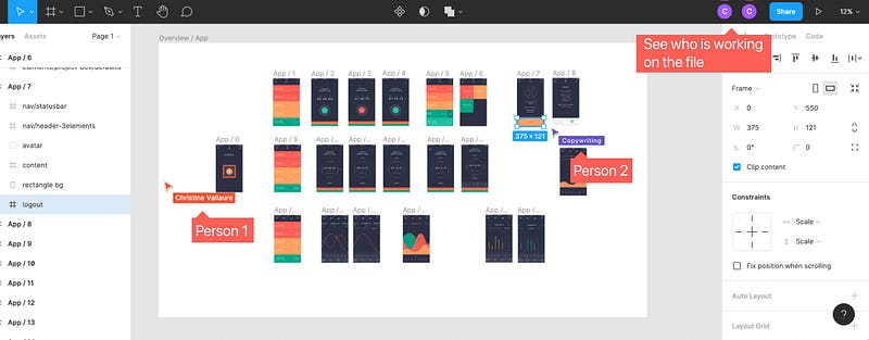
Other designers and copywriters → Set to EDIT MODE. Provides access to all features. You will see other users avatars and cursor and can work alongside in real-time in the same file!
Developers → set to VIEW MODE. This will show them all specs (toggle CSS, iOS and Android code). They can also access your prototype in action and can download any assets in the size needed.
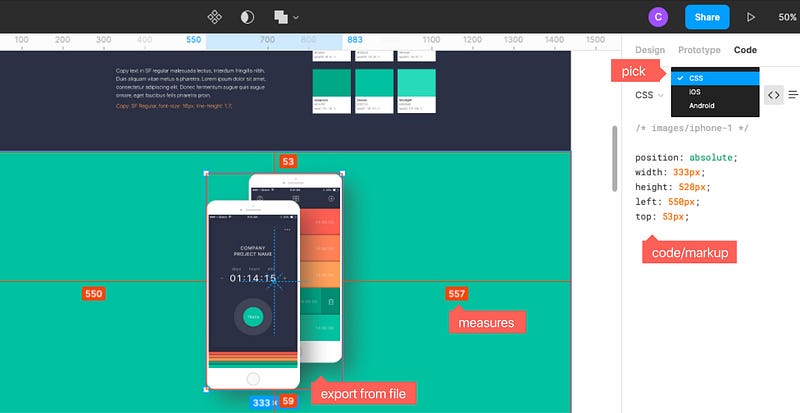
☝Note: If you are sharing with the developers while still working on the file, it’s best to set up a page in your design clearly labelled as latest tidy versions for the dev-team to avoid confusion.
7.5 Exporting Assets
As described above, in Figma all assets can be exported in any size directly from the shared files, even if only rights to “view” are granted, therefore, as a Designer, you don’t need to export anything yourself. If you, however, would like to, in any case, this is how it works:
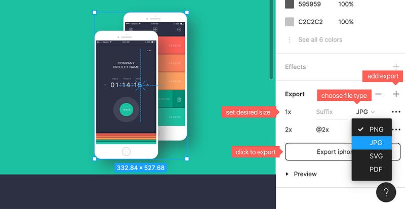
- Choose the object
- Click on export on the right-hand side properties menu
- Define how to export and done!
☝Note: Remember naming with “/” e.g. image/home/imagename , icon/iconname which will sort exports automatically into files.
Cheatsheet, when to export what:
- SVG → use for vector files, such as logos and icons. SVGs are scalable to any size without losing quality. Make sure to export a png fallback.
- Jpg → use for all sorts of rectangular images and photos with no opacity needed. Make sure to supply actual size(1x) as well as retina resolution (2x).
- Png → Use, if an image or photo needs a transparent background. Also 1x and at least 2x export required.
- 1x, 2x → 1x is the actual size, 2x twice the size. 2x isneeded for crisp images on retina displays. Note that 2x, 3x etc. comes with a Suffix of @2x, @3x which will be relevant identifying and calling the right image when coding.
- w & h → You can also set a width, e.g. 300w = image with a width of 300px. Same for height=h
- pdf → used if you want to export a whole page, e.g. for mailing it or adding into a presentation and need high quality.
Learn UX/UI online anytime, anywhere
Stay connected with news and updates!
Join our mailing list to receive the latest news and updates from our team.
Don't worry, your information will not be shared.
We hate SPAM. We will never sell your information, for any reason.
