Understanding CSS Grid
Oct 30, 2018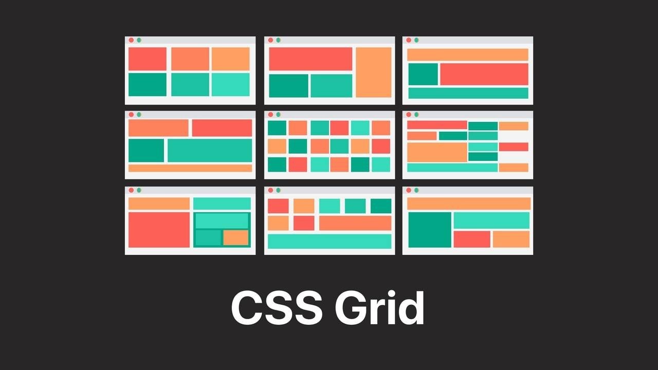
CSS Grid is a new way to create two-dimensional layouts on the web. With just a few lines of CSS, you can create a grid that was hardly possible before without JavaScript. No plugin or complicated installs, no heavy additional files, no more design limitations due to 12-columns only.
What kind of grids are possible?
In short: Actually, almost all grids that come to mind and many more. Choose the space, size and location of different grid items freely. A good overview of the most common grids with Markup can be found at Grid by Example.
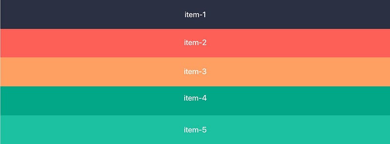
Let’s get started! HTML markup for our example:
A div with the class of .container holds 5 div/items (can, of course, be more or less). If you like, you can experiment with the HTML and CSS markup in CodePen directly.
<div class="container">
   <div class="item color-1"> item-1 </div>
   <div class="item color-2"> item-2 </div>
   <div class="item color-3"> item-3 </div>
   <div class="item color-4"> item-4 </div>
   <div class="item color-5"> item-5 </div>
 </div>
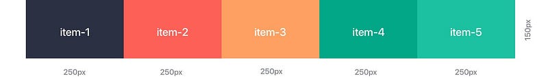
Base: Set Grid, Columns and Rows in the CSS
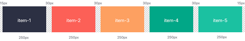
In the CSS, we turn the .container class into a grid by adding display:grid. With grid-template-columns we activate the desired columns, in this case, 5 columns with 250px each. With grid-template-rowswe can set the height of the row (if needed), in this case 150px. And that’s it, the first grid is done!
.container{
  display: grid;
  grid-template-columns: 250px 250px 250px 250px 250px;
  grid-template-rows: 150px;
}
/* short form: */
grid-template-columns: repeat(5, 250px);
Setting the gutter
Any desired distance between the items can be created with grid-gap for all items or separate for horizontal and vertical distances with column-gap and row-gap. By the way, you can use all common units, for example px for fixed gutters or % for flexible gutters.
.container{
  display: grid;
  grid-template-columns: repeat(5, 250px);
  grid-template-rows: 150px;
  grid-gap: 30px;
}
My Grid my Units, I prefer REM!
Now a lot of Grid Systems (not all) will be using px values, at least for the Gutter and breakpoints. To make my designs more accessible I prefer translating them to rem/em. There are some issues with Safari when it comes to breakpoints but I prioritize accessibility over Safari bugs. So assuming that our base size is 1rem=16px we just divide the px we would usually have by 16. I rounded it just to keep it clean, plus I do not believe in px perfect anyways. So our columns would be 250px/16=15,625 so for this example I rounded this up to 16rem
.container{
  display: grid;
  grid-template-columns: repeat(5, 16rem);
  grid-template-rows: 9rem;
  grid-gap: 2rem;
}
Automatic distribution to the available screen area with “fr”
A designer’s dream! With Fractional Units short fr you can divide the available space according to your wishes! Here, for example, we divide the screen size into 6 parts. The first column takes 1/6 = 1fr of the space, the second column 3/6= 3fr and the third column 2/6= 2fr. You can of course also add grid-gap if you wish.
.container{
  display: grid;
grid-template-columns: 1fr 3fr 2fr;
}
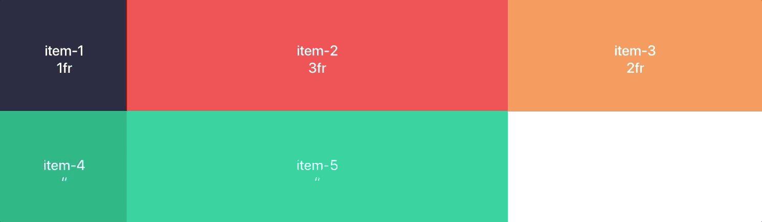
all rows flexible
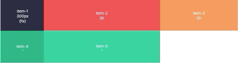
Mixing for fixed and flexible columns
rem and fr can be mixed in any desired way the rest will adapt to the available space. Works like a charm!
.container{
  display: grid;
  grid-template-columns: 19rem 3fr 2fr;
}
Absolute freedom of arrangement
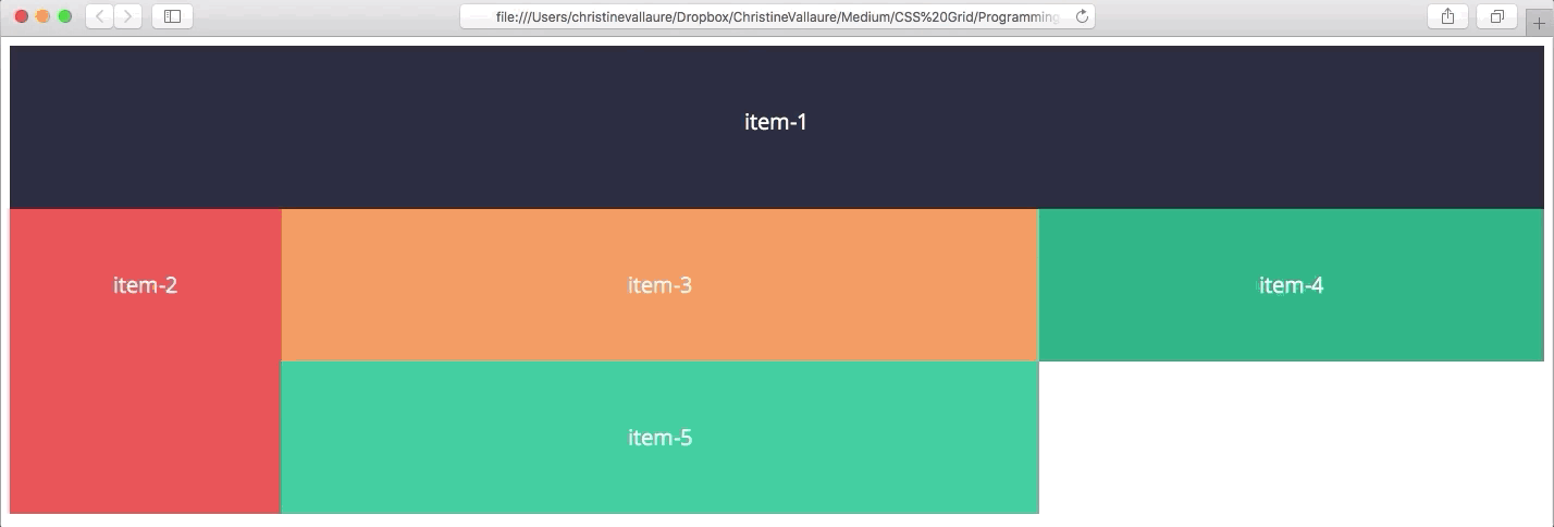
The best thing is, all items can take up as much space as you like even within the gird! For this purpose, a starting point is set with grid-column-start and the end with grid-column-end. Or in short grid-column: startpoint / endpoint;
.container{
  display: grid;
  grid-template-columns: 1fr 3fr 2fr;
}
.item-1 {
 grid-column: 1 / 4;
}
.item-5 {
 grid-column: 3 / 4;
}
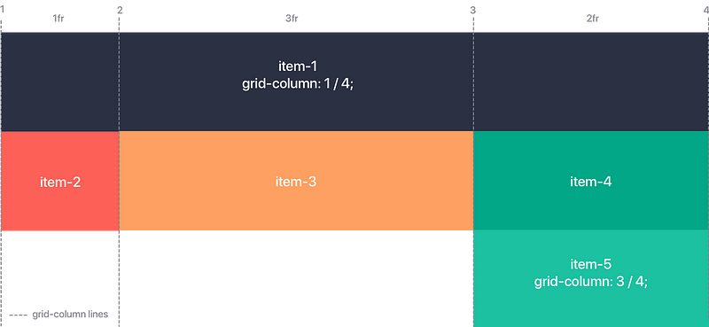
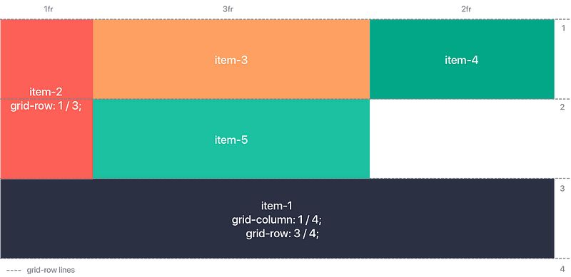
Don’t get confused by the grid lines, they start at the very beginning of the first item!
The same applies to vertical or full-area distribution!
Here CSS Grid can shine and prove its superiority over Boostrap and Co. Items can take all vertical sizes and positions with the help of grid-row. As we will see in the next example, this is an absolute advantage for adapting to different screen sizes and devices.
.container{
  display: grid;
  grid-template-columns: 1fr 3fr 2fr;
}
.item-2 {
 grid-row: 1 / 3;
}
.item-1 {
 grid-column: 1 / 4;
 grid-row: 3 / 4;
}
Adapting to different screen sizes and devices? Of course!
Here CSS Grid also has a clear advantage over conventional grids, depending on the screen size you can not only switch from flexible to fixed elements with media queries, but you can also adjust the position of entire items!
.container{
 display: grid;
 grid-template-columns: 15rem 3fr 2fr;
}
.item-1 {
 grid-column: 1 / 4;
}
.item-2 {
 grid-row: 2 / 4;
}
@media only screen and (max-width: 45em){
  .container{
   grid-template-columns: 1fr 1fr;
  }
  .item-1 {
   grid-column: 1 / 3;
   grid-row: 2 / 3;
  }
  .item-2 {
   grid-row: 1 / 1;
  }
}
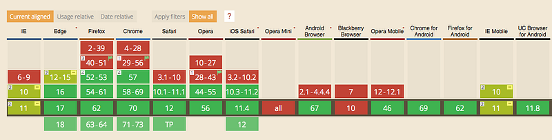
Browser support
CSS Grid is now natively supported by all modern browsers (Safari, Chrome, Firefox, Edge). With global support of 87.85%, CSS Grids are already an alternative to Boostrap and Co.
Real-life examples with CSS Grid
Slack, Company Website
Medium, Articles
Skyler Hughes, Photography
Max Böck, front-end developer
Design+Code, tutorials for web designers
Hi Agency, Deck, template page
www.christinevallaure.com, UX/UI Design
Learn UX/UI online anytime, anywhere
Stay connected with news and updates!
Join our mailing list to receive the latest news and updates from our team.
Don't worry, your information will not be shared.
We hate SPAM. We will never sell your information, for any reason.
