Figma’s Auto Layout Update (Nov 2020)
Nov 24, 2020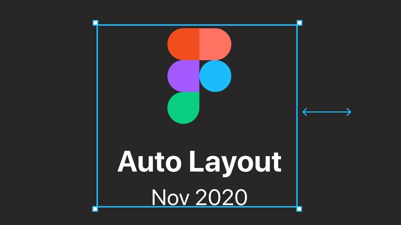
The original Figma auto layout was released in 2019. Already a nice feature but to be honest, I did not use it too much in my everyday work except on the obvious button or main menu. My main reason was that it went a bit crazy with responsive constraints which I use a lot. Now, this has changed for sure with the latest release in November 2020.
A reminder: What auto layout is/was all about
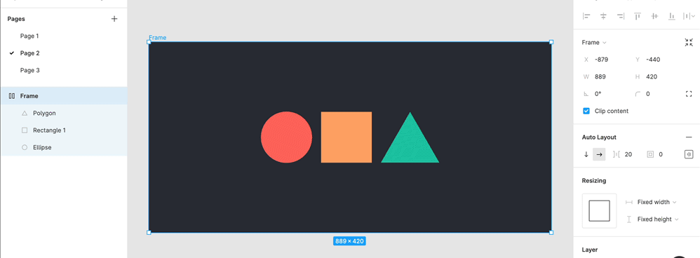
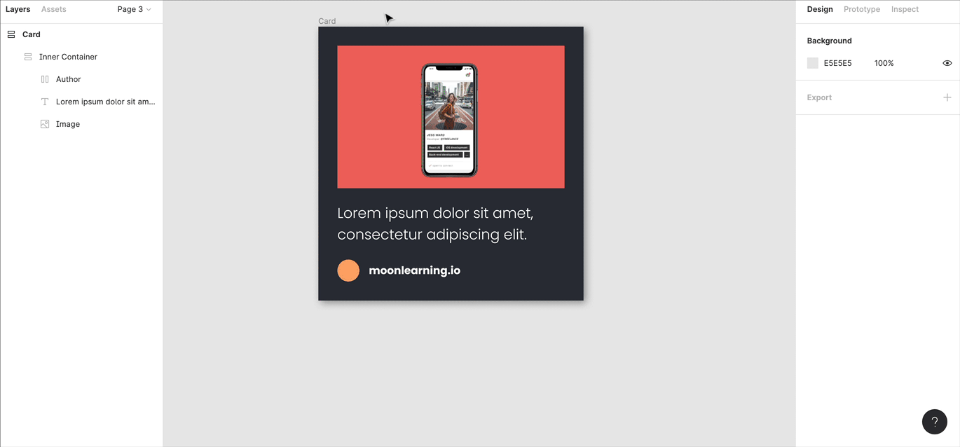
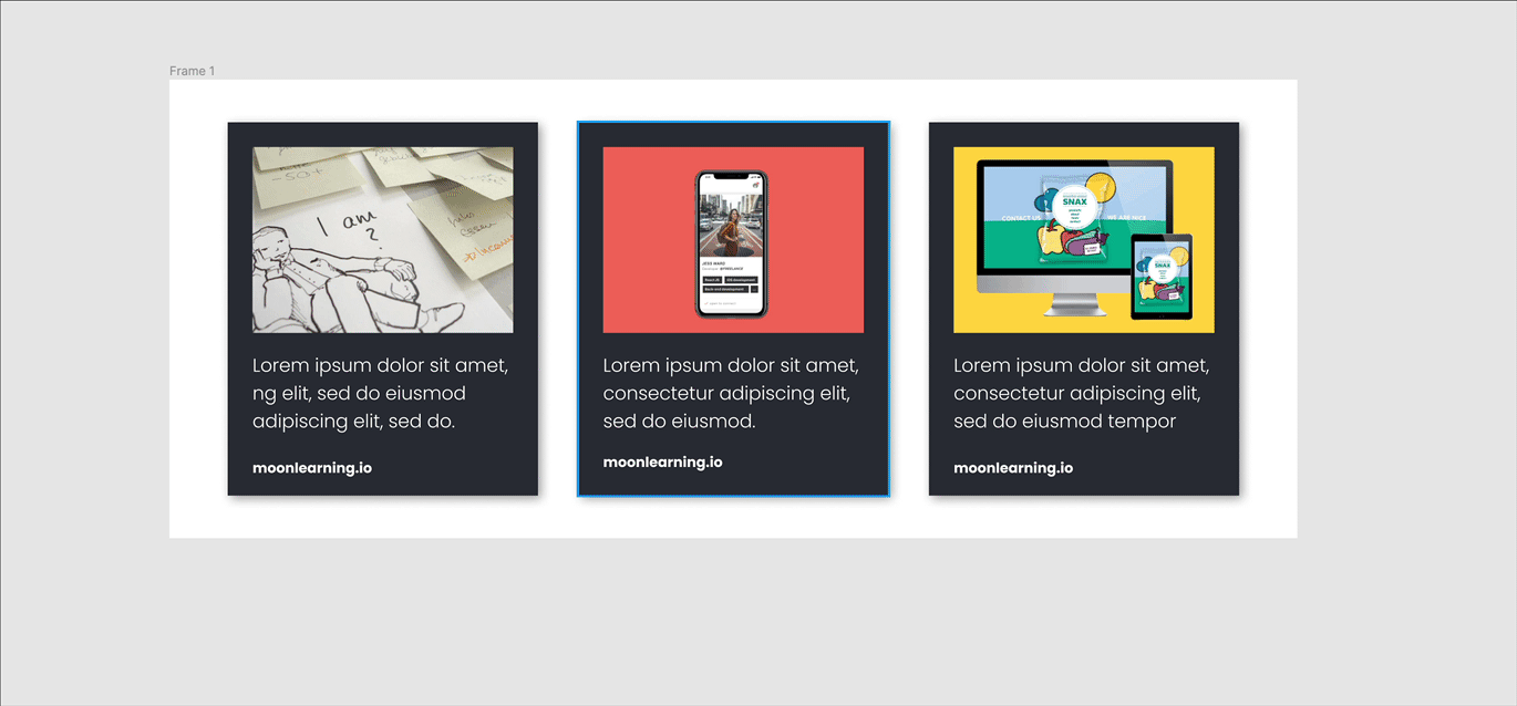
So to recap, auto-layout basically it lets you create dynamic frames that react and resize according to their content. I am sure you have seen the classic button example. Create a frame, add content and convert the frame into an auto-layout (either via the right hand-properties panel or press Shift +A ). The auto-layout frame will now adapt to changing content. Auto-layout can be nested vertically and horizontally to create refined components and even whole pages.
So what is so new and exciting?
The whole auto-layout menu was re-designed and became just so much more powerful, especially as you can combine the new features into endless possibilities in combination with constraints (which is called resizing in auto-layout frames). Let me run you through the changes. You can download Figma’s official auto-layout playground file here. I highly recommend it!
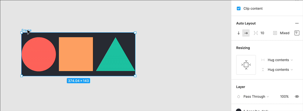
1. Individual Padding
You can now adjust the padding either equally for all or individually for the left, right, top and bottom. Really nice detail!
💡 A little trick: You can also type the values as you would in CSS, separated by commas, e.g. 10, 25, 15, 20 (top right bottom left padding) or 10, 20 (top/boom, left/right). Much faster!
2. Alignment & Distribution
Objects can be aligned horizontally or vertically as in the previous version. However, a very nice add on is that you can now also align children of an auto-layout frame within the frame with the new alignment tool. The great thing is that they keep their set padding. This is basically the slow death of the alignment tool as we knew it (still there at the very top of your right-hand properties panel).
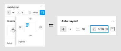
Hidden below the individual padding, you find distribution. This one takes a second to get your head around, especially as you can mix and match so much here. Distribution basically lets you choose how to align child objects within an auto-layout frame.
Packed → define the space between them yourself
Space between → automatically defines the space distributing them evenly.
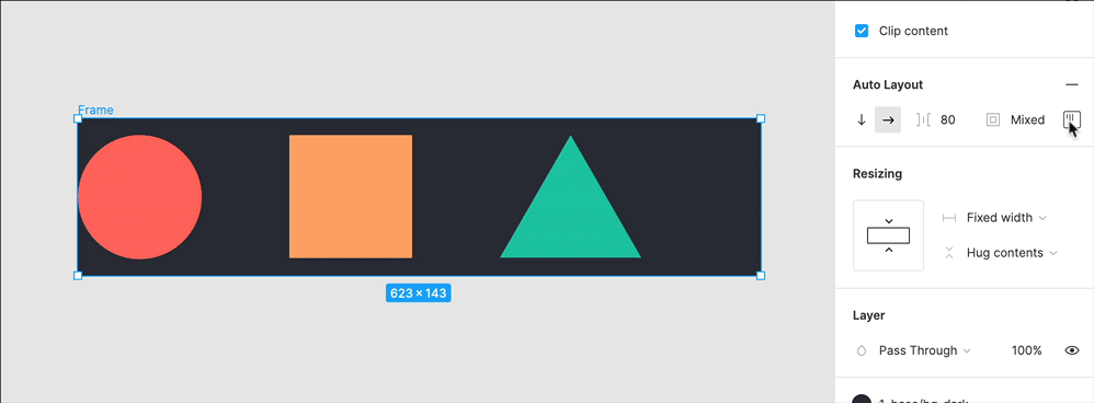
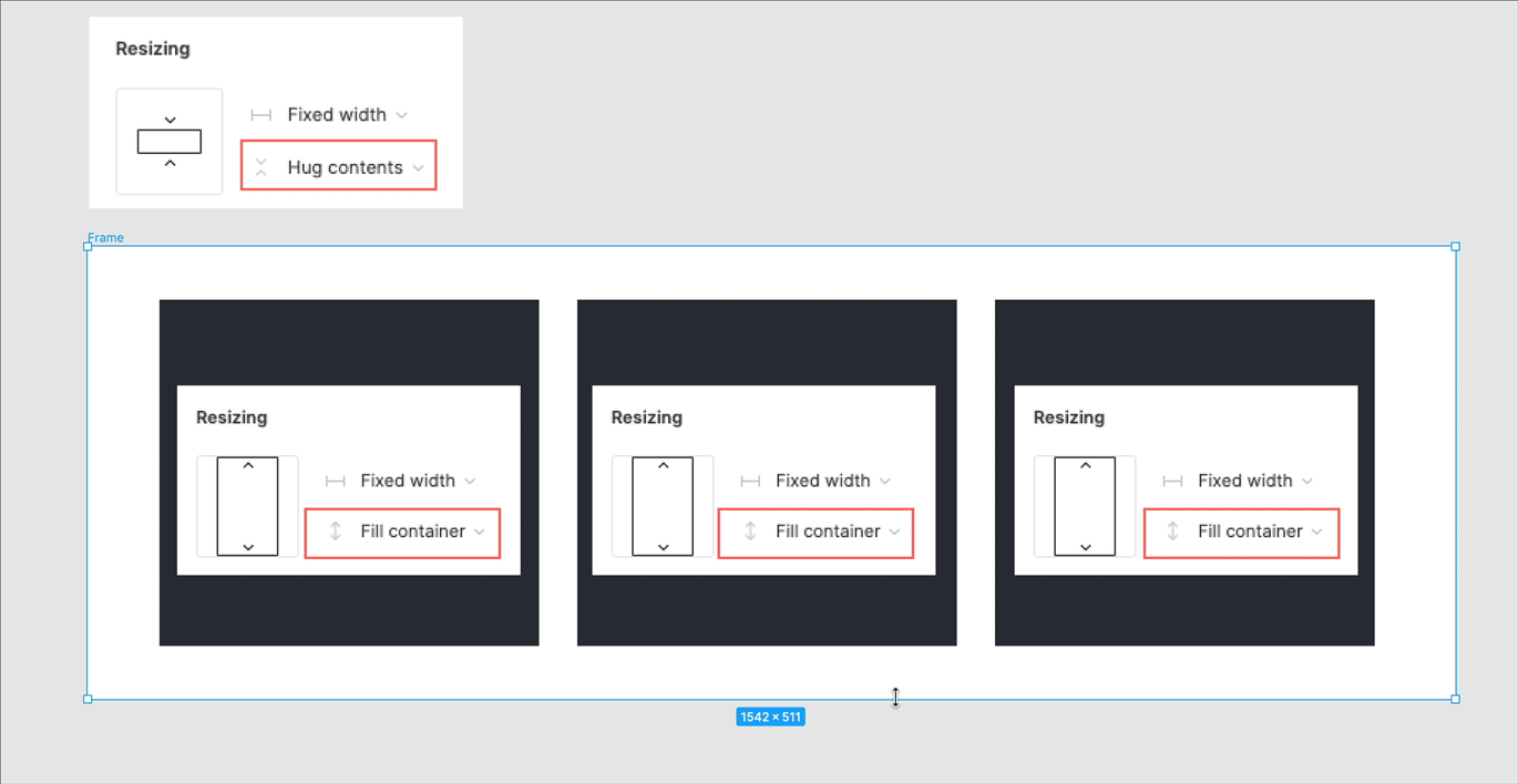
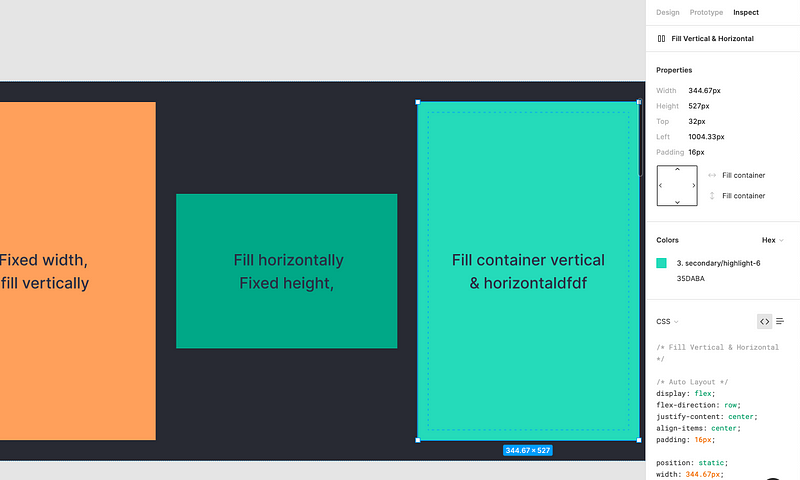
3. New resize menu. Where the magic happens.
Resizing defines how an object behaves when the parent frame or content changes size. If you used constraints before this sounds familiar, however now auto-layout and constraints (called resizing in an auto-layout frame) go hand in hand, which is a real game-changer.
There are three options and you can mix and match them for height and width with one another!
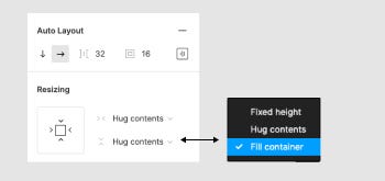
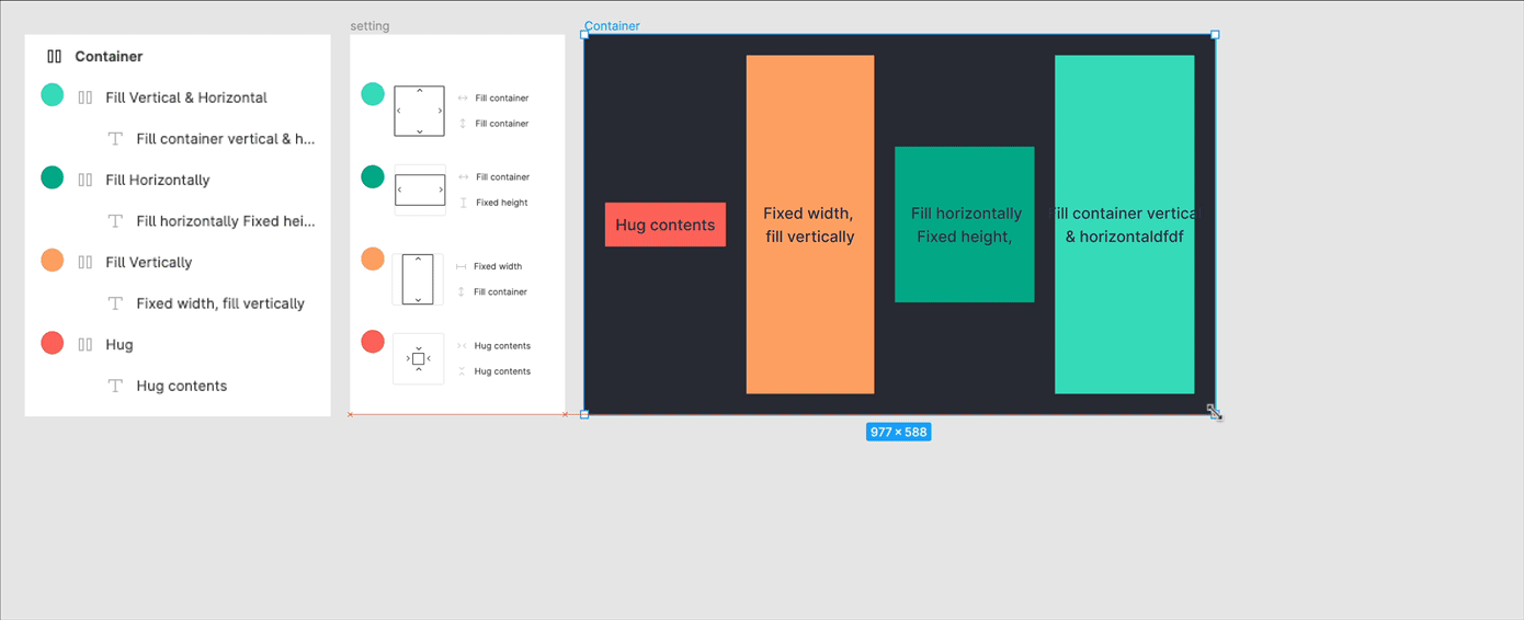
- Hug contents → besides this being the cutest UI-feature name I have ever come across (especially during a pandemic) it is pretty much the old auto-layout setting as we knew it: It always fits around its content as defined in height and/or width.
- Fixed → Keeps a fixed width and/or height when the parent is resized.
- Fill container → You guessed it, stretches to fill the parent container in height or width, very important for responsive behaviour. This is only available for objects inside an auto-layout frame.
4. New Nested Resizing options in action. My favourite problem solvers:
Responsive AND content-adaptive. Finally!
The beauty is that you can mix and match everything to create powerful responsive elements. As mentioned, previously, auto-layout and constraints did not really work hand in hand. Now you can apply responsive behaviour and keep all your spacing setup when changing content. This will be the biggest advantage of my personal workflow!
Mixing fixed and fluid settings
This was possible but tricky before. Now it is just some clicks and nice and clean. Within an auto-layout frame, you can set some elements to fixed and some to fill the container and mix fixed and fluid.
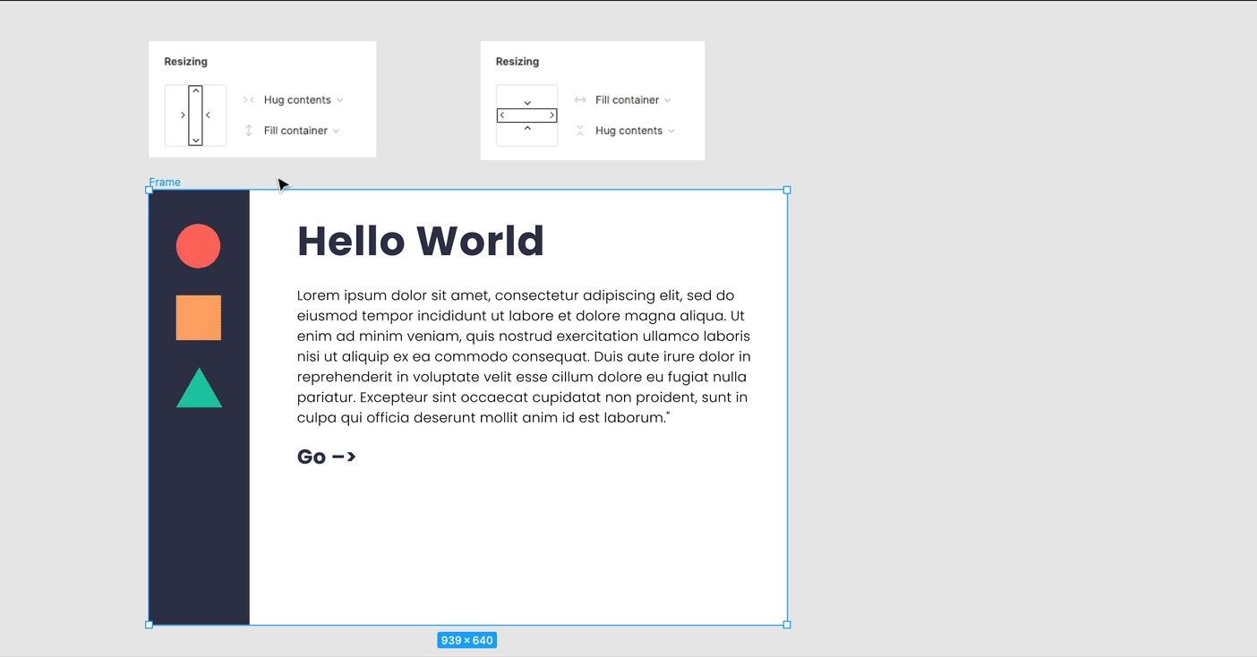
Same height for all children!
If you have more content in a container but want all of them to have the same height, simply set all children to fill the container in height and the parent auto-layout frame to hug in height. Done! Funny enough now this is harder to do in CSS than in Figma!
This is basically how it works: If one container has more content, it increases the height of the parent, and all others follow. As if you would resize the container by hand like this:
Definitely check out the official Figma auto-layout playground file here, many more amazing examples !
5. Inspect mode update
The new feature also reflects in the Specs panel; you will see that it translates it to flexbox and also shows some general behaviour.
6. I am still missing one thing though: Locking aspect ratios for images!
I needed this one so badly for 90% of my projects. Now I have all this great responsive setup and tools but see my image ratio falling apart every time I resize, which is such a shame. Apparently, it is in the making so I will be patient and resize manually for now.
By the way, if you want to keep on using grids with constraints.
I was a bit worried about this as all my files are set up with responsive grids. That is no problem. Simply keep your frames with the grids as they are (so do not add auto layout on the parent frame holding the grid!). Then within this parent frame, you can add auto-layout to all elements. So you can keep the “left & right” setting in constraints to lock the auto-layout object to your columns, and it is fully responsive.
Learn UX/UI online anytime, anywhere
Stay connected with news and updates!
Join our mailing list to receive the latest news and updates from our team.
Don't worry, your information will not be shared.
We hate SPAM. We will never sell your information, for any reason.
