We’re talking about fr units… but what even is CSS Grid?
Most designers think “grid = columns.” Define columns, place stuff inside.
That’s not how the web thinks.
When developers say “grid,” they mean CSS Grid. And CSS Grid isn’t a column system; it’s a system of grid lines. Those lines create cells.
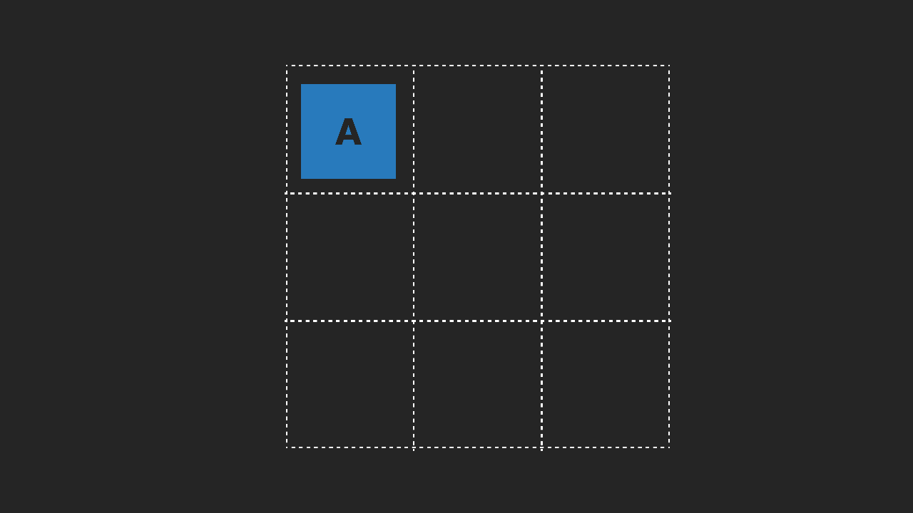
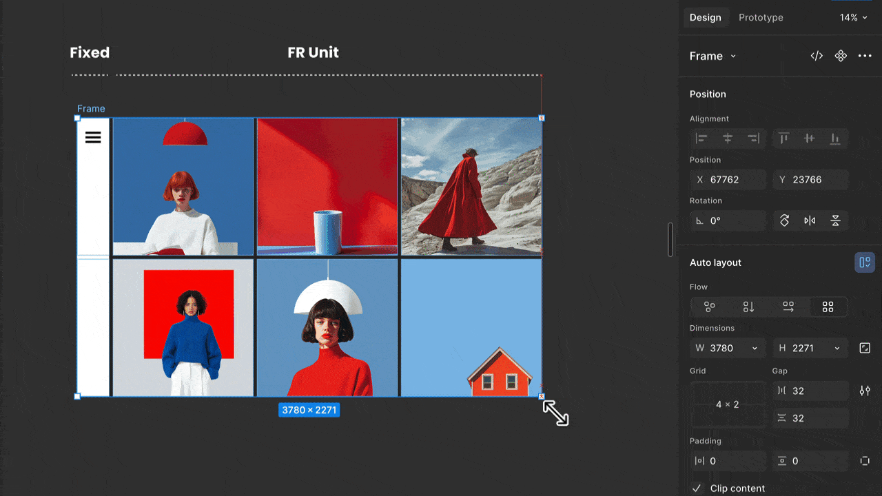
Think bento box – the good one.
You can move dividers, add compartments, merge them, and resize them.
That’s why grid items can span, sometimes overlap, and land on exact positions. If grid lines and units aren’t in your head, spans in Figma will always feel like witchcraft.
Figma is drifting closer to real CSS Grid. The old columns-only model won’t survive.
📚 → I cover all of this in my Figma responsive design course in more detail.
So is responsive design in Figma the same as in CSS?
No. Design tool layout will never match the browser. Not Figma. Not Penpot. Not any of them.
I love grid. I love CSS. I love design tools. And the push toward better alignment is right. Auto Layout mapping to Flexbox is huge. FR units are great. This is progress.
But CSS isn’t a static layout system. It’s a rule-based engine that reacts to content, space, language, and context. Design tools can model that. The browser actually performs it. And that is ok, but as a designer, you need to understand the basics.
Design tools represent layout.
The browser performs layout.
That gap matters and needs to be dealt with!
So what does this mean for designers?
You don’t need to write production code, but you do need to understand the basics. Flexbox. CSS Grid. Container queries. Enough to think in rules, not pixels, and to know where Figma ends and the browser takes over. That’s where real conversations with developers start.
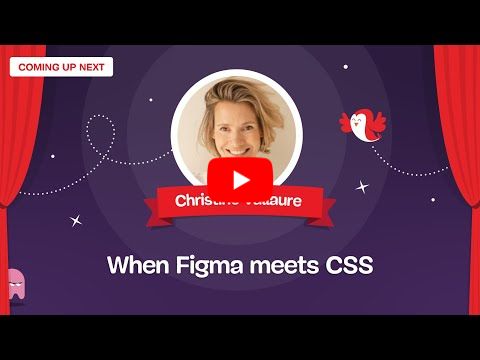
Below is a conference talk I gave at Smashing Conference Antwerp last year, breaking down the essential CSS concepts designers should understand, how they map to Figma, and where collaboration with development is non-negotiable.
|
Also, all my courses on moonlearning.io are built around this too, from layout and typography to variables, always with the technical reality in mind. Check them out!
Moonlearning news:
Upcoming Talks & Workshops
Building with AI for everyone. An introduction to Lovable. FREE
Sign up here for free – Online, Jan 20th 2026 🖥️
Freelance Unlocked 2026
Conference Talk – Berlin, Germany 🇩🇪
Smashing Conference, April 2026
Conference Talk – Amsterdam, Netherlands 🇳🇱
See all workshops and events -->
Want to learn more about Figma, UI and Building?
Get a moonlearning.io membership today and access all courses, from beginner to pro, covering Figma, UI and UX principles, and how to not only design but also build your own websites and products. 

Responses