These were the most popular posts of 2025. The ones people told me they actually used.
A quick recap to get you warmed up, because next week we’re jumping back into hands-on building topics for designers, plus a full introduction to Lovable. Don’t miss that.
But some NEWS first:
🩷 Free live online workshop:
Building with AI for everyone. An introduction to Lovable.
I’m running a free live intro to Lovable with Smashing Conferences.
This is for total beginners.
No tech background.
No AI knowledge.
We build together and make sense of it as we go. Come say hi 👋
🗓 Tue, Jan 20, 2026
⏰ 09:00–10:30 PT | 18:00–19:30 CET (1h)
👩🏫 Christine Vallaure
🎟 Free workshop + live Q&A
👉 Register free:
https://smashingconf.com/online-workshops/workshops/building-with-ai-lovable-christine-vallaure/
🎓 Lovable Course on moonlearning (launching next week)
My full Lovable course on moonlearning is releasing next week.
You can already check the full syllabus here: moonlearning.io/lovable
⚠️ Prices are going up once the new course and builder track are released (end of next week).
If you are an active member, your price stays stable as long as you remain signed in. Always.
⏳ Not a member yet?
You can still join at the current price until Friday the 16th.
After that, prices go up.
Most popular posts of 2025
1. Stop naming Figma text styles H1, H2, H3.
Stop naming your Figma text styles H1 / H2 / H3. It works early on, but breaks once your product grows, marketing jumps in, and accessibility matters. Designers start overriding styles, developers guess semantics, and consistency erodes.
The mistake: treating visual styles and HTML semantics as the same thing.
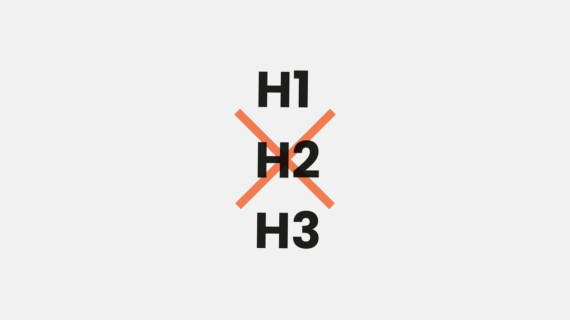
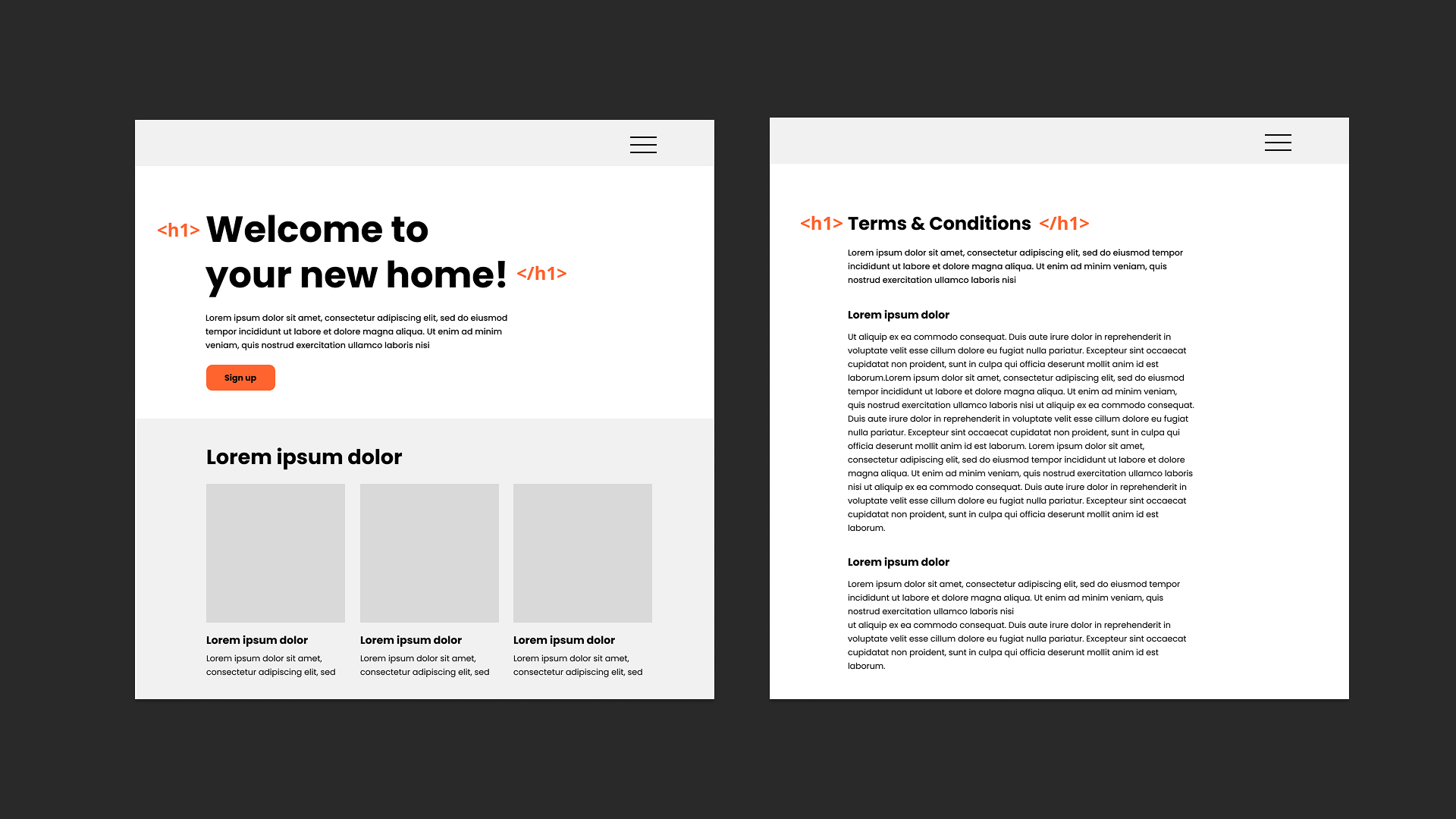
Headings in code communicate hierarchy. Visual styles communicate tone and scale, and the biggest text in the UI isn’t always the semantic H1.
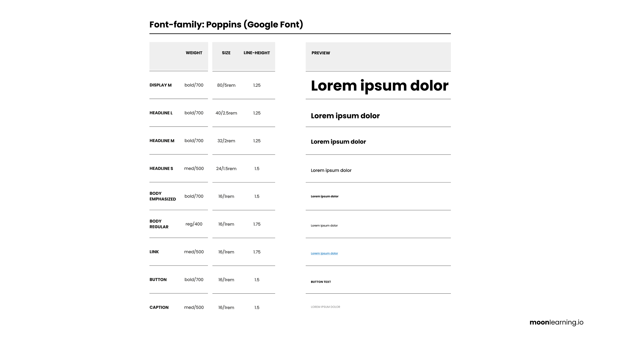
A better approach: name styles by visual purpose, not HTML tags. Think Display, Heading, Body, Caption, Label with sizes like XL, L, M, S.
Designers design visually. Developers apply the correct semantic tag. Everyone wins.
Keep semantics and styling separate and your system stays scalable and consistent.
📚 → Full course on typography in UI Design: moonlearning.io/typography-preview
2. "Print Variables" Plugin
My favourite plugin for working with variables in Figma is "Print Variables".
The default variable panel in Figma can feel tedious to navigate. With one click, Print Variables gives you a complete overview. It is faster to scan, easier to check, and much better for spotting inconsistencies.
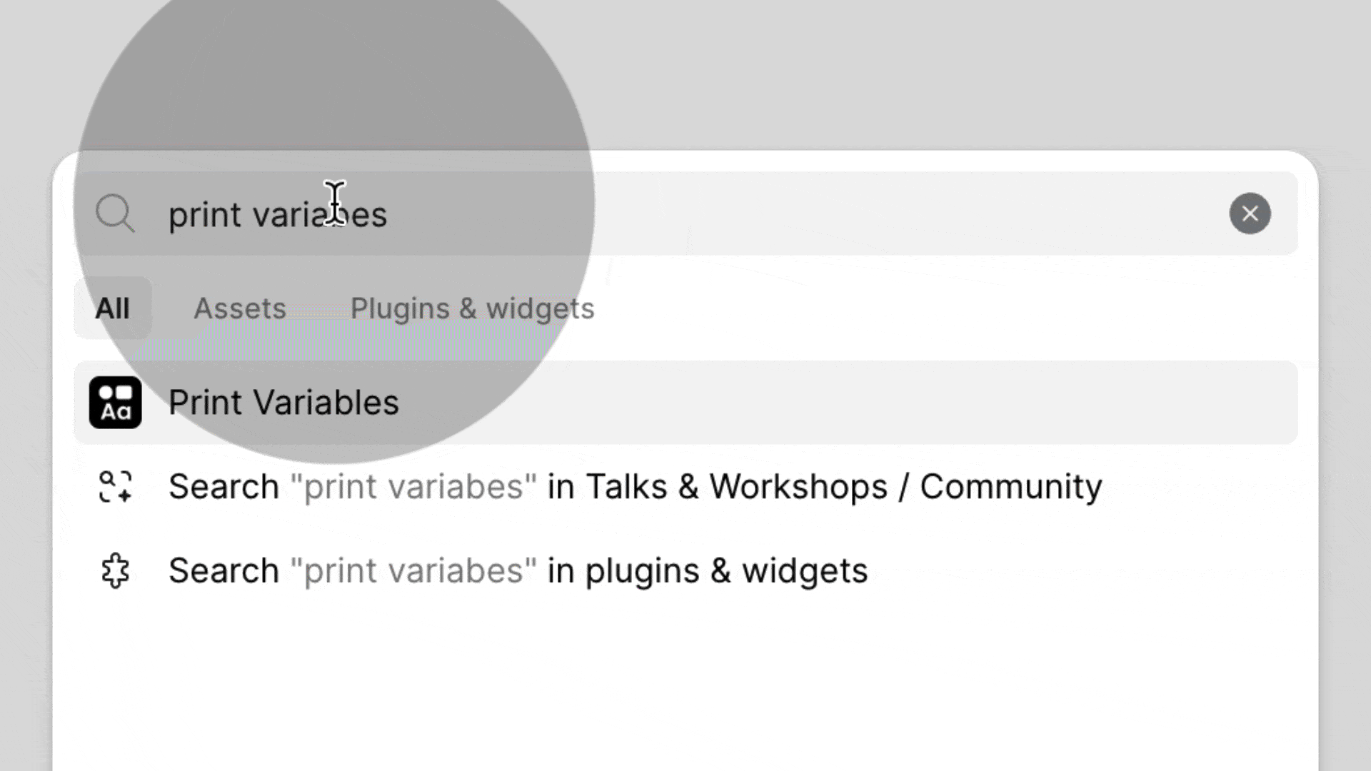
If you are starting to build systems with variables, this plugin is a simple but powerful helper. No paid promotion here, just a tool I find genuinely useful.
3. FR units with Figma Grids
Figma added FR units to its grid! Hooray!
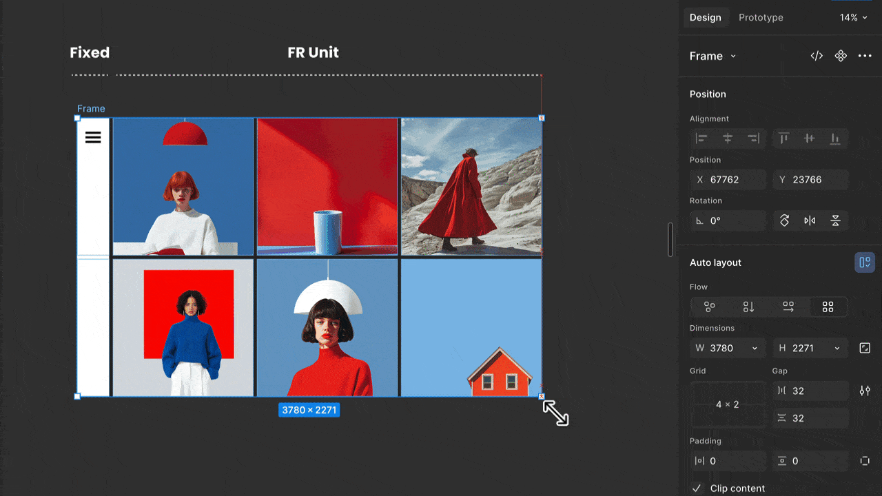
What fr units do in Figma
A fractional unit fr is a fraction of the available space.
Instead of fixed widths, the grid splits leftover space proportionally.
Until now, in auto layout, “Fill container” meant everything behaved like 1fr. Equal columns. Always.
Where this comes from
Figma Grid is based on CSS Grid, where fr Units are fundamental.
In code, you can give columns different weights like 1fr, 2fr, or 0.5fr, and the browser handles the math.
Now Figma does the same.
Why this matters
We can now design real column ratios, not just visually approximate them.
Layouts scale better, grids behave like actual CSS grids, and handoff gets (a little bit) cleaner.
The biggest impact happens when using Figma Sites, for sure. Everything is automatically translated into fractional units in CSS Grid on publishing, giving us much more flexibility and a more solid design output in the browser.
Tiny unit. Big shift.
Designing is moving closer to how the web actually works.
4. Organising Components with Sections
Did you know that placing your components inside a section automatically creates subfolders in your Assets panel?
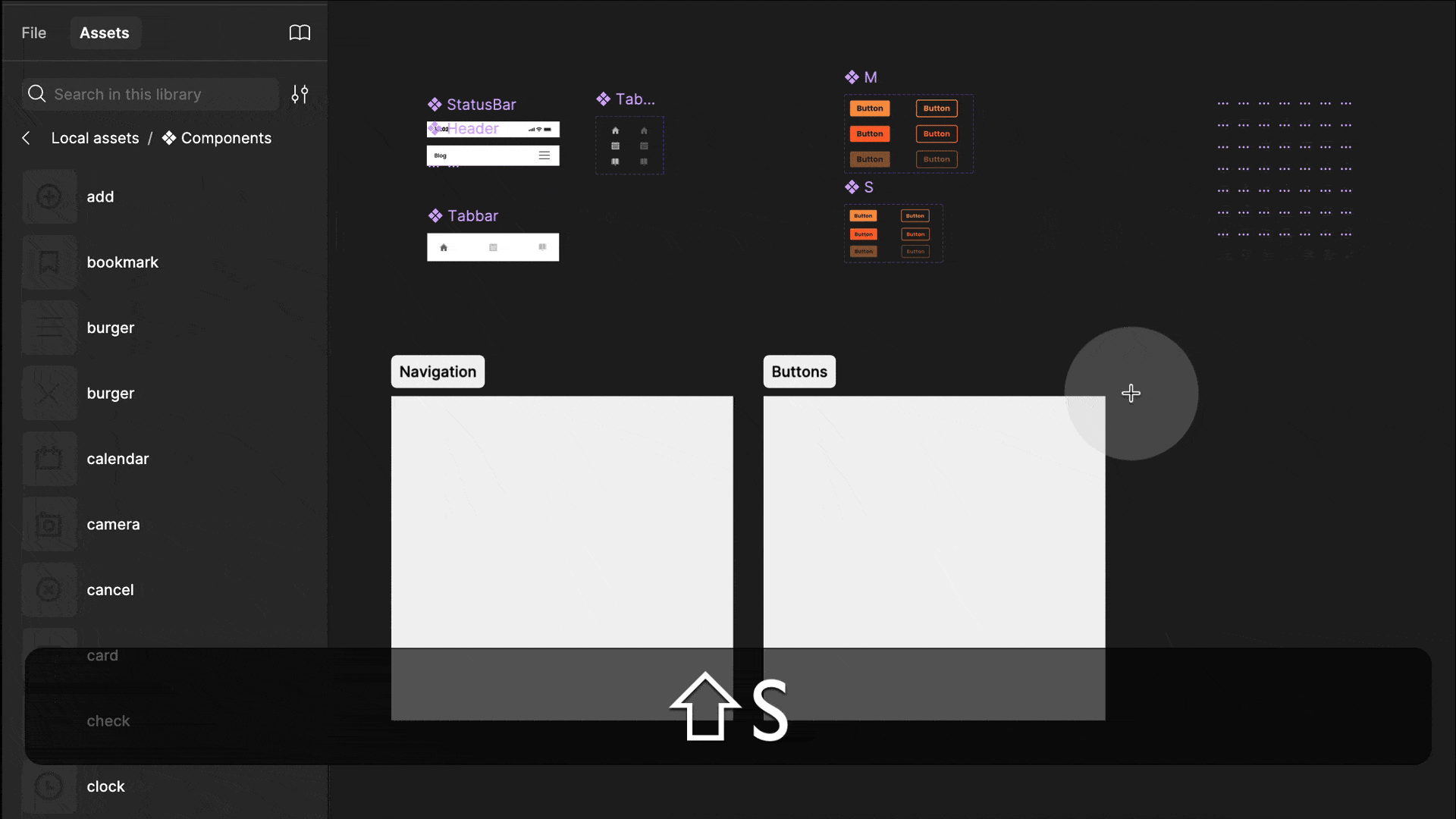
You can still use the “/” naming convention to organise components, but sections are better. Press Shift + S to create a section, then drag your components onto it. Figma will create a subfolder automatically.
You can move components or rename sections anytime, so this setup stays flexible.
It also works with frames, but sections have one big advantage: you still see the component icon and info, which keeps things clear for anyone opening your file. I also like adding small frames with notes or documentation inside those sections later and it keeps everything in context.


Responses